
Table of Contents
Architects need to showcase their work and expertise online, and their website is often the first point of contact with potential clients.
A website with a good design can effectively convey the architect's message and provide a positive user experience.
This article will explore some examples of architect websites and highlight the design elements that make them stand out.
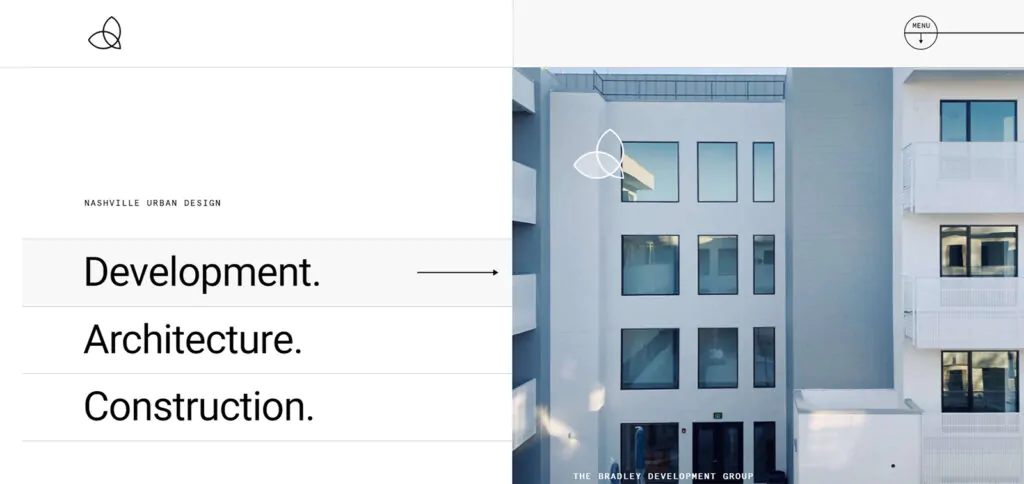
URL: https://verticallybuilt.com/
Vertically Built is aimed at a website that features clean lines, large and crisp images, and the right amount of white space.
These design elements are prominently present in their new website build, allowing for a visually appealing and easy-to-navigate user experience.
With a focus on showcasing their projects and expertise, the layout effectively presents information while maintaining a modern and professional look.
Notes to take from this website:
Builder used: WordPress
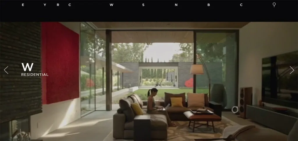
The design of the EYRC Architects website is both unique and visually striking.
By utilizing captivating imagery and attractive typography, the website stands out from more traditional architecture sites, ultimately enhancing its overall appeal.
Additionally, the website's layout is easy to navigate, providing visitors with an immersive experience to explore the firm's projects and expertise.
Notes to take from this website:
Builder used: Hubspot
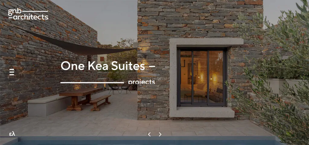
URL: https://www.gnb-architects.com/en
The GNB Architects website features high-contrast overlays and large images that guide users through the site. The layout is clean and allows visitors to easily find the information they need. The use of whitespace emphasizes the visual impact of the images and creates a modern and professional look. Overall, the website design effectively balances aesthetics and functionality.
Notes to take from this website:
Builder used: WordPress
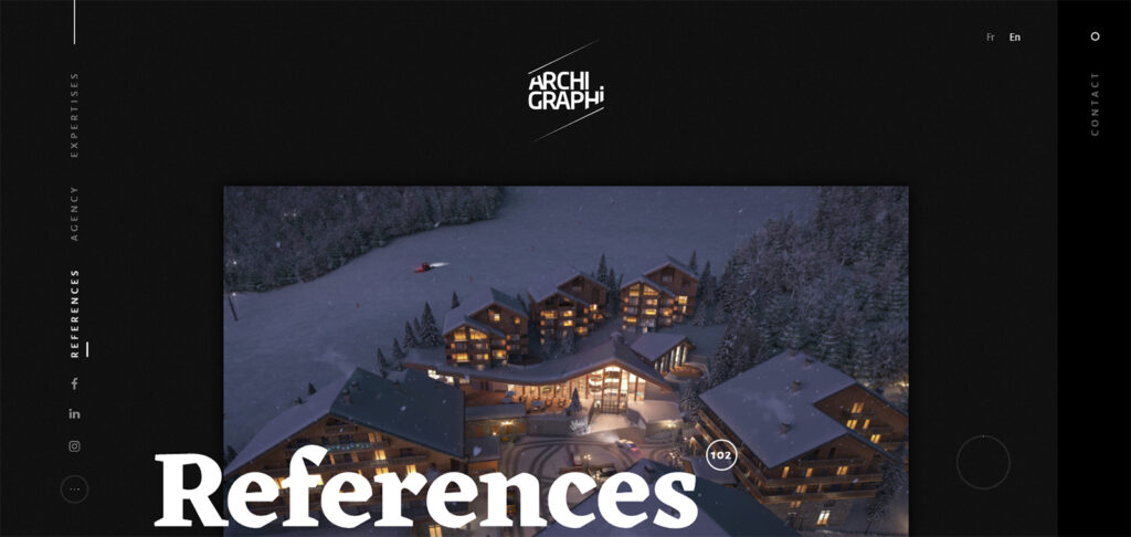
URL: https://archi-graphi.fr/en/
Archi-Graphi's architecture website impresses with its modern and sophisticated design. High-quality images are featured against a black background creating a dramatic feeling that appeals to visitors and users.
The masonry layout showcases their project portfolio from different perspectives. The scrolling animation adds even more dynamism and interest to the design.
Additionally, their unique menu display allows visitors to explore the firm's expertise, references, team members, and agency. Overall, Archi-Graphi's website offers a visually appealing and interactive experience for visitors.
Notes to take from this website:
Builder used: WordPress
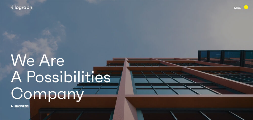
Kilograph's website features full-width hero videos capturing visitors' attention from the moment they land on the page.
The website's clean typography, layout, and gifs contribute to its overall visual appeal. Additionally, subtle yet engaging animations enhance the website's user experience.
Notes to take from this website:
Builder used: WordPress
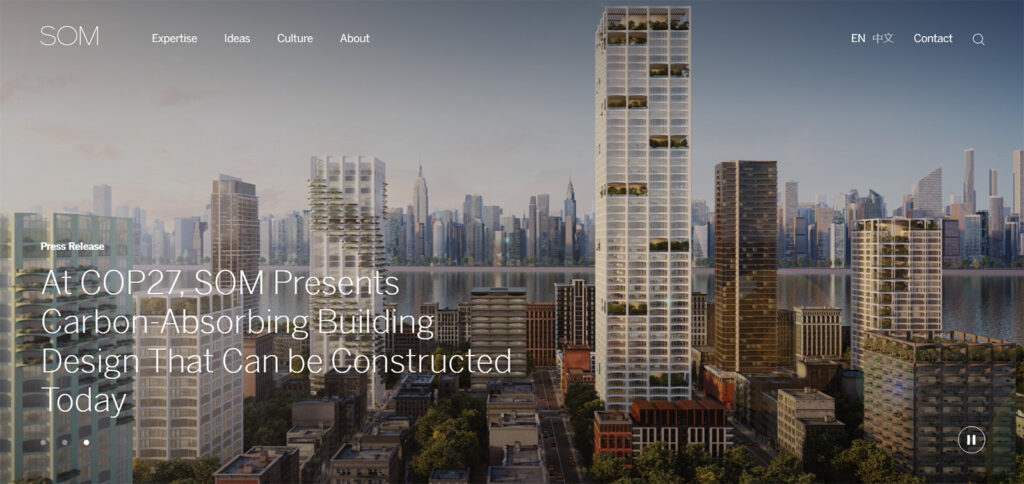
URL: https://www.som.com/
SOM's website showcases their big experience with a simple grid layout and small thumbnail images that display the name and location of each project.
The website features multiple filters to help visitors easily search and access the wealth of information available. The homepage's full-screen video loops creatively highlight the agency's recreational projects.
Overall, SOM's website effectively manages plenty of information and offers a user-friendly experience for visitors.
Notes to take from this website:
Builder used: WordPress
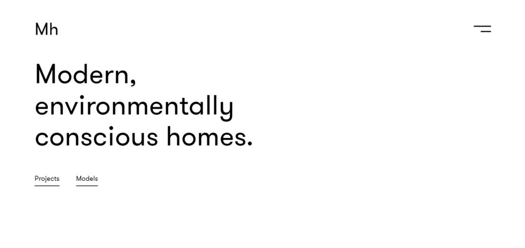
MAFCOHouse’s website employs a minimalist design that connects users with nature through bright, high-quality images and bold typography.
The simple interface and effective use of whitespace make for easy navigation and a refreshing user experience.
Overall, the website showcases how a focus on environmental consciousness can be integrated into a successful web design.
Notes to take from this website:
Builder used: WordPress
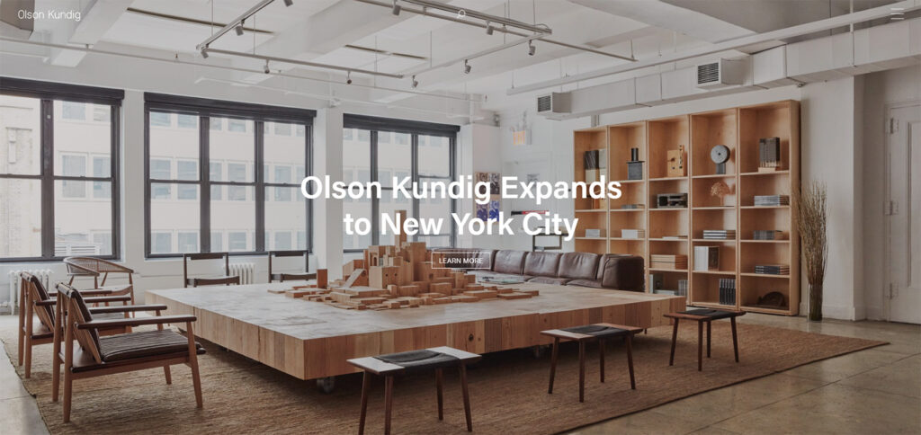
Olson Kundig's website features a sleek, modern design with a minimalist layout. High-quality images of their buildings throughout the site give a sense of familiarity with the environment and showcase the portfolio.
The block structure effectively displays examples of their work descriptions and designs, making it easy for visitors to find what they need.
Overall, Olson Kundig's website is aesthetically pleasing, making it effortlessly for visitors and architects to search for their desired information.
Notes to take from this website:
Builder used: WordPress
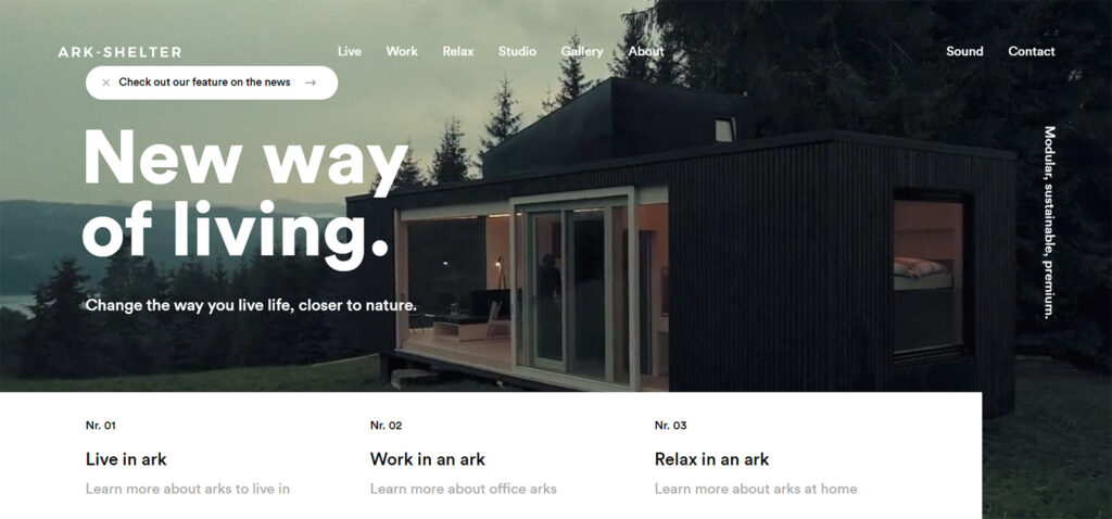
URL: https://www.ark-shelter.com/en
Ark Shelter's website's minimalist layout incorporates high-quality images and videos to showcase their modern housing designs.
The hero video immerses visitors in the Ark Shelter experience, while clear and straightforward navigation makes it easy to explore the pages.
Rather than focusing on features, the content highlights the lifestyle surrounding Ark Shelter, reinforcing their vision.
The heavier use of the content on their homepage adds to the overall aesthetic without overwhelming the visitor.
Notes to take from this website:
Builder used: Shuttle
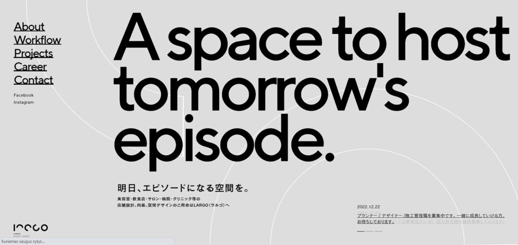
Largo Studio's website design features a modern layout with geometric graphics and an animated scrolling effect that engages the user upon entering. The homepage features videos that tell a story and showcase their work.
The layout is simple, with clean lines and clear navigation, making exploring the site's different pages and projects.
The site's overall aesthetic is thoughtfully composed and imaginative, carefully representing the studio's work and clients.
Notes to take from this website:
Builder used: WordPress
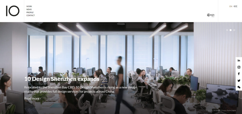
The website design for 10 Design incorporates a fullscreen slideshow on the homepage to showcase their work and design philosophy effectively.
The layout is simple and user-friendly, featuring clear navigation and a grid format that facilitates easy exploration of their diverse projects.
The clever utilization of white space and typography enhances the overall aesthetic appeal and enriches the user experience.
Notes to take from this website:
Builder used: Custom
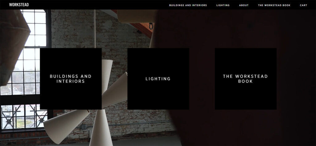
Workstead's website design features a modern and minimalistic layout with a monochromatic color scheme that exudes sophistication and elegance.
One of the more intriguing aspects is the dynamic background that changes with each visit, creating a unique experience for the user. The homepage showcases their work through high-quality images and offers clear navigation for easy exploration of their projects.
The clever use of negative space and typography adds to the overall aesthetic, enhancing the user experience.
Notes to take from this website:
Builder used: Custom
URL: https://handelarchitects.com/
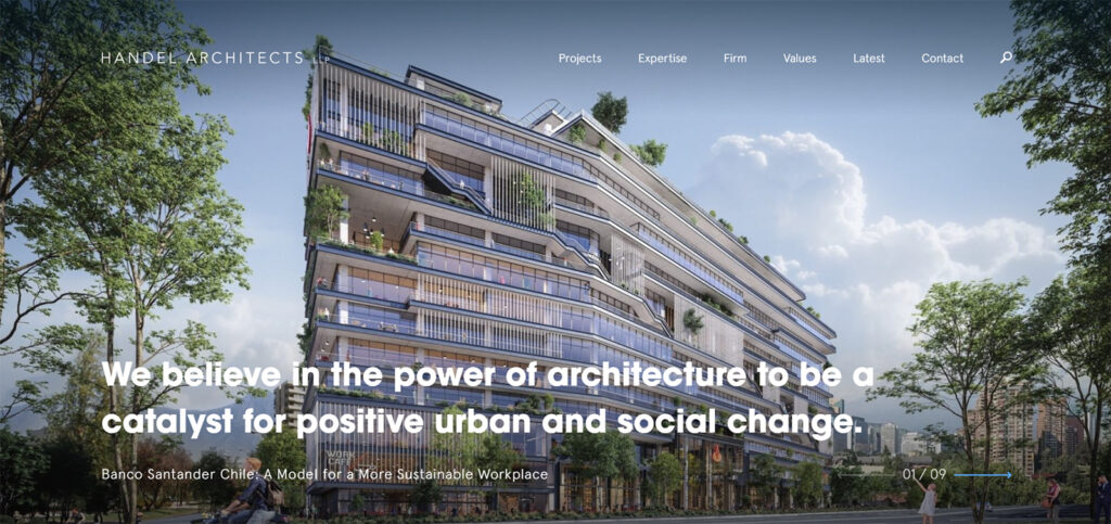
The homepage of Handel Architects' website presents a strong statement about the firm's commitment to social and community change, and eye-catching visuals clearly illustrate this message.
High-quality images incorporated into the site's design are emotionally compelling, while the elegant white space and thoroughly fashionable font add to the allure of the material.
Notes to take from this website:
Builder used: Craft
URL: https://www.1100architect.com/
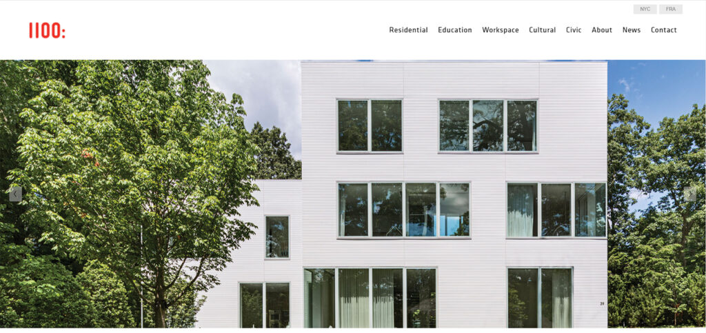
The 1100 Architect's website's design has a really simple and minimalist layout that emphasizes firm's projects and expertise. The site features high-quality images of their work displayed in a grid-like format.
The use of white space and clean lines throughout the site create a cohesive and elegant look. The menu is easily accessible and organized, allowing for easy navigation.
Overall, the website effectively showcases 1100 Architect's design philosophy and impressive portfolio.
Notes to take from this website:
Builder used: Squarespace
URL: https://www.raadstudio.com/
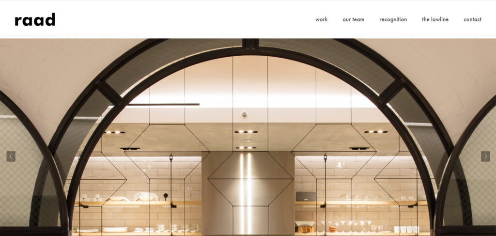
The website of the RAAD Studio is simple, modern, and minimalist, with a vertical layout highlighting its portfolio.
The website has a minimal palette of black and white colors with refined typography that contributes to its overall sophistication.
Overall, the website effectively conveys firm's sophistication and originality in design.
Notes to take from this website:
Builder used: Squarespace
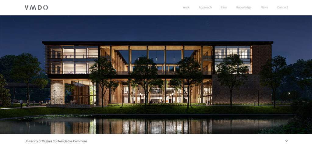
The VMOD Architects website has a sleek and clean layout that's easy on the eyes. The website uses high-quality images to showcase their projects, and the layout employs white whitespace to make the content easy to read.
The menu is easy to navigate through as well.
Overall, the website effectively showcases the firm's expertise and design philosophy.
Notes to take from this website:
Builder used: Custom
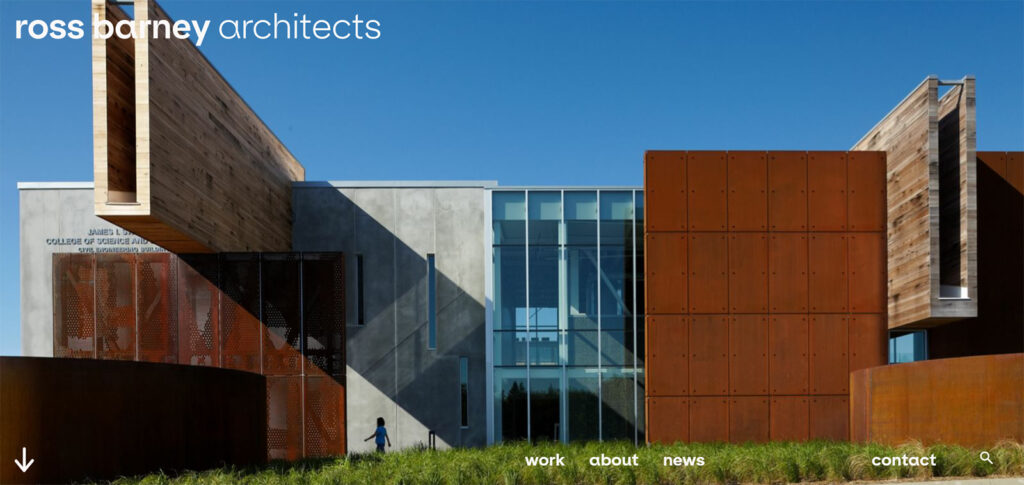
R-BArc Architects' website boasts a modern, sophisticated design with a black-and-white color scheme that creates a sense of elegance.
The high-quality images featured throughout the site showcase the firm's impressive portfolio, and the negative space menu contributes to a clean and sleek look.
The portfolio section prominently displays visually stunning images of their work, effectively conveying the firm's unique design aesthetic. Overall, the website effectively showcases R-BArc's expertise and design philosophy.
Notes to take from this website:
Builder used: Squarespace
In conclusion, the websites of these architecture firms showcase the power of simplicity and elegance in web design.
They effectively use high-quality images, clean layouts, and negative space to create an overall sense of sophistication and showcase the firm's expertise.
By prioritizing their portfolio and making it easily accessible through intuitive navigation, these websites succeed in conveying the unique design philosophies of each firm.
As such, they serve as great examples for anyone looking to create a successful website in the architecture industry.