Updated on: June 7, 2023
15+ Amazing Florist & Flower Shop Websites Examples
By Maria Castillo
Table of Contents
Building a gorgeous design with eye-catching image galleries is the secret to making your online store profitable.
Visit our list of the 17 best florist & flower shop website examples if you don't know where to begin.
You can find the motivation you require from these examples to start your online flower shop.
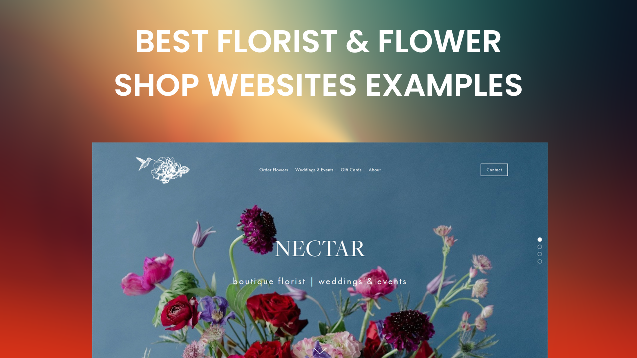
URL: https://twigandarrow.com/
This flower company designs your website in a simple way, using a white background to contrast with your photographs. Its entry page is divided into three categories that are visualized through photographs sliding the images to the left.
On the site's header, you can also see icons such as the drop-down menu, a shopping cart, and a search engine, making the customer find everything he needs effectively.
Sliding down, you can also see photos of your products, details, price, and the option to add to the cart presented; this allows the effects to be noticed by the customer.
The above features will enable the customer to make sure that the products are to their taste and feel comfortable when buying.
Notes to take from this website:
Builder used: Shopify

URL: https://www.sadiesfloral.com/
This company is responsible for both wedding preparation and the sale of flowers. Your website is pimple, without a headline.
Your customers can find their services in the center of the website, where hyperlinks are displayed that will immediately lead them to the pages.
On their main page, they exhibit colored images, which captsitor'capacitors.
The website shares contact mode and a blog sharing relevant information that may interest customers.
Notes to take from this website:
Builder used: Squarespace

URL: https://www.twigandtwinedesign.com/
This website is simple and delicate tstraightforwardpany manages to retract its purpose through a simple and uncomplicated design. The site has shortcomings that take its customers to the different categories, saving the time of its visitors.
Besides, possessing galleries of photographs of their products in real contexts provide a different perspective to visitors about buying.
The page also adds its Instagram feed as a form of contact. This website creates simple and beautiful environments in everyday life that enchant its visitors.
Notes to take from this website:
Builder used: Squarespace

URL: https://www.floralink.com.au/
This brand of artistic flowers manages to combine dark colors with vibrant red on its website, creating an attractive and intriguing atmosphere.
It also has a search bar and a shopping cart icon, which make it easy for the customer to complete the process.
They offer an option to create an account within the website so that the customer has options to stay informed about their products.
And they incorporate their social media, which makes them a reliable company.
The above elements help the company to obtain a suitable positioning in the market as its customers have the facilities to approach effectively.
Notes to take from this website:
Builder used: Shopify

URL: https://flowerandthorn.com/
This company provides floral services and has a simple but attractive web design. The home page shows a black background with different flowers.
It also has a static header with access to the other floral services.
Scrolling down, you can see high-quality images of their products.
The website also has direct access to their virtual store, where you can see the name of each product and its price. The above features make this website easy to use for everyone.
Notes to take from this website:
Builder used: Shopify

URL: https://www.stackwood.net.au/
This website has a simple design and high-quality photographs. The client can see transition photos on its home page showing the company's work.
It also has a search bar that will make it easier to find products.
Option to create an account on the website and an icon showing how many purchases have been registered.
Customers feel comfortable with this type of account that manages to summarize all information in an easy-to-understand way.
Notes to take from this website:
Builder used: Shopify

This brand, dedicated to the sale of flowers, exposes on its website its products professionally; its photographs are high-quality, offering descriptions and details. Its design is simple and easy to use, contrasting the flowers with a white background, making them stand out more.
Also, on their homepage, you will find all the categories regarding their flower services.
Additionally, it offers options to search for products and register on the site. This makes it a preferred flower site for your customers due to its ease of use and simplicity.
Notes to take from this website:
Builder used: Shopify

URL: https://tableandtulip.com/
This is a company dedicated to the sale of flowers and wedding planning. Their website has a simple and easy-to-use design.
It has a static header with drop-down options and a search bar and cart counter, making its a helpful website for its customers.
They also show information about your brand and your work through high-quality photographs, and also by scrolling down, there are options to contact the company.
This design gathers all the information the client needs in one.
Notes to take from this website:
Builder used: Squarespace

URL: https://www.vinesflowers.com/
This flower company has a website with a very timeless and classic design. It uses different fonts, some with a colonial style, that is visually striking.
It uses pastel tones to show the delicacy of its products. It also has a static menu with essential options such as calling the company directly, searching for products, and creating an account on its website.
Their website also displays their products through small images divided into subcategories.
The design of this website is ideal for representing elegance and class to customers, generating more sales.
Notes to take from this website:
Builder used: Weebly

URL: https://www.flwrshop.com/
This company offers different events, specializing in weddings and flower sales.
Their website has a simple and traditional design that gives it elegance. Its page has a white background and a memory with photographs with a sliding effect in the center.
Its menu is static, with a portfolio of its products, contact information, and a blog.
Also, the brand wants to make clear the purpose of their products, so they make it very clear in every corner of the website.
This generates consumer confidence in buying their products and satisfaction in seeing what they want in their portfolio.
Notes to take from this website:
Builder used: Squarespace

URL: https://www.restorationbloomsfloral.com/
This flower brand is in charge of providing visual satisfaction to the customer since their work is portrayed on their website in an aesthetically ordered way, combining colors and sizes of their photographs.
It also has a delicate and simple look on its home page, using a vintage-style photographic background. In addition, clicking on the bar on the main screen will take the customer to a form to communicate directly with the company.
All these details make this design ideal for those flower companies that want a friendly approach with their customers.
Notes to take from this website:
Builder used: Webflow

URL: https://www.thebloomgeneration.com/
The Bloom Generation is a brand with flower products. Their website is delicate and simple, and on their main page, a pop-up window to subscribe to the site jumps without annoying the user.
Their website reflects their brand identity as they use graphics to accentuate it.
The website also has a drop-down menu that, in turn, displays subcategories.
Additionally, the site uses pastel tones to approach the beauty of flowers and create a visually elegant environment.
Customers then feel comfortable and satisfied browsing the website, as well as confident that the brand takes care of displaying their work throughout the website.
Notes to take from this website:
Builder used: Squarespace

URL: https://thefloralsociety.com.au/
This website has an elegant and colorful aesthetic to reflect the beauty and freshness of flowers. On their home page, they offer quick shopping options, promoting their products at first glance.
In addition, by scrolling down, you can see a photo gallery displaying different categories.
They also have opportunities to create an account on the website and access to add to the stock exchange, offering the customer ease of managing the products they buy through the virtual store.
Finally, they have a session where they give the customer many reasons to buy their products, generating their reliability and trust.
Notes to take from this website:
Builder used: WordPress

This website is in charge of finding beautiful flowers around the world. Its home page contains transitional images, which are used to highlight the products sold by the brand.
This website has no header, only a simple drop-down menu icon that will give the options to different categories of the website.
Additionally, at the bottom, there is a link where the client can schedule a consultation, generating efficiency in customer service.
This website has elements that make your customers feel comfortable visiting it and conf that they will find their ideal product.
Notes to take from this website:
Builder used: WordPress

URL: https://www.ftd.com/
This company has been around for over a decade and makes its identity felt through the vintage style of its website. When visitors open the page, a pop-up window offers discounts for their subscriptions.
Thanks to the colored palettes that mix pastels and dark tones, it also has a classic stylistic touch. It has a drop-down menu containing a search engine with filters, allowing your customers an advanced search.
Additionally, on their home page, they anchor a section of their address book to send gifts, showing their willingness to help the client.
The website encourages its visitors not only to buy flowers but also to make beautiful gifts.
Notes to take from this website:
Builder used: Contentful

URL: https://www.arenaflowers.com/
This UK-based flower brand has a very attractive website, using dark colors to contrast with the colorful designs of their flowers. This site promotes its flower arrangements through pop-up windows offering discounts for the first purchase.
As well as through their email, encouraging their customers to subscribe to the site. In its header, you can drop down the menu and create an account on the website.
Also, the shopping cart icon is located at the top of your home page.
Additionally, it shares reviews made by its customers, increasing the visitors' credibility. These features make prospective buyers want to access products immediately.
Notes to take from this website:
Builder used: Contentful
It might be difficult to build a website for an effective florist.
You can design a stunning website for your brand by keeping your target audience in mind and drawing inspiration from excellent floral website examples.