
Table of Contents
Welcome to the ultimate guide on creating a product page that wows! In this article, we will show you the best product page examples, and outline what you need to include to help grab potential customers’ attention, convince them to purchase and ensure a fun and smooth user experience.
We'll also give you some top tips on increasing customer engagement on your product page and standing out from the competition. So let's get started!
At BulletProof, you can find a variety of sports and health supplements, guides for upgrading health, recipes, and other helpful information for more healthy living. The product page here is set up to be as functional as possible. There are a few product pictures included from different angles.
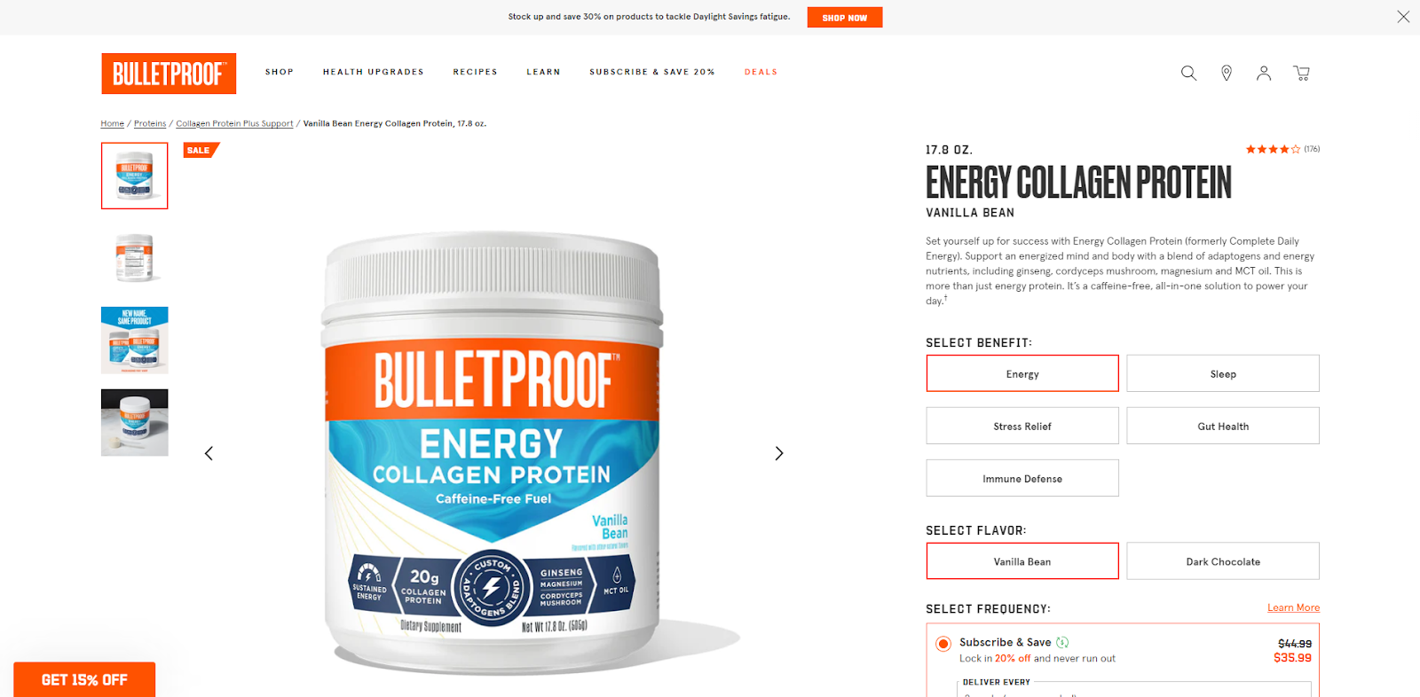
Users can read a short product description on the right and choose various product options. The option buttons are clearly visible and apparent. Setting a default choice for a product subscription is an excellent way of attracting the customer’s attention to this option. Added list of the product’s benefits provides the essential information for the user in a convenient format.

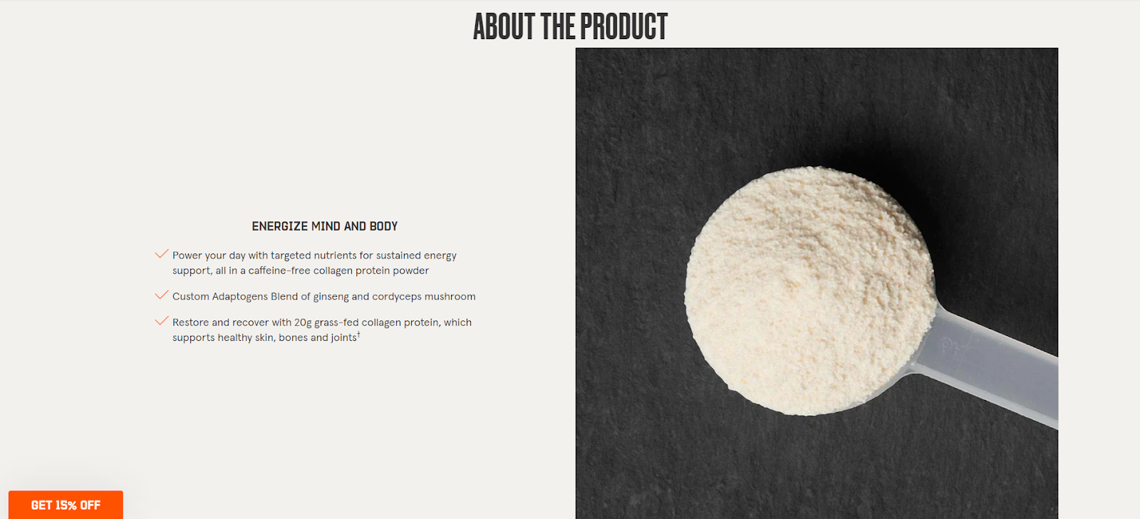
For those who want to learn more detailed information about the product’s usage, ingredients, and advantages to the body, there’s a large block with concise information and associative photographs.
Notes to take from this website:
Being one of the market’s leaders, it is no surprise that Apple has a powerful product page. Scrolling through this page, you can see beautifully integrated high-quality photographs with a black or gradient background.
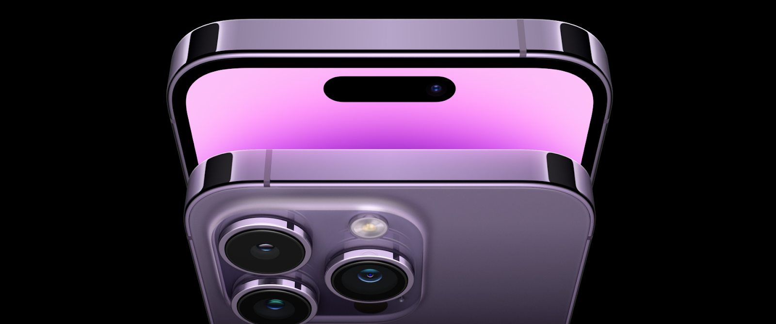
Smooth transitions reveal more and more information about the product as you scroll down. The users can learn more about the product’s specifications, new features, and strong characteristics.
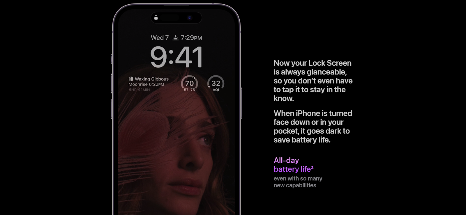
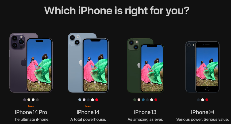
We love this product page's uniqueness and its focus on creating an experience for the users by taking them on the journey of introducing the product in-depth. Scrolling down, users can also see available deals, app features, and links to more specific information. The products are displayed in comparison with each other at the end of the page and feature unique short descriptions. We believe this helps users effortlessly decide which product fits their needs the best.
Notes to take from this website:
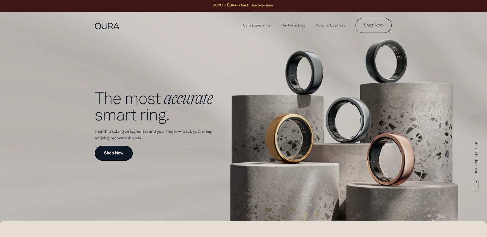
The Oura Ring product page starts with a modern, high-quality photograph of the products, instantly attracting the visitor's attention. The users are introduced to the product immediately, with a bold statement and a one-sentence description. This area also has an incorporated call-to-action button, encouraging users to shop now. Overall, this section is a powerful yet concise introduction to the Oura Ring, intriguing users to learn more.
This product page features smooth transitions and beautifully built sections, showcasing the product’s unique features. We find it fascinating how the page portrays these features by introducing the associative information on the product’s app.
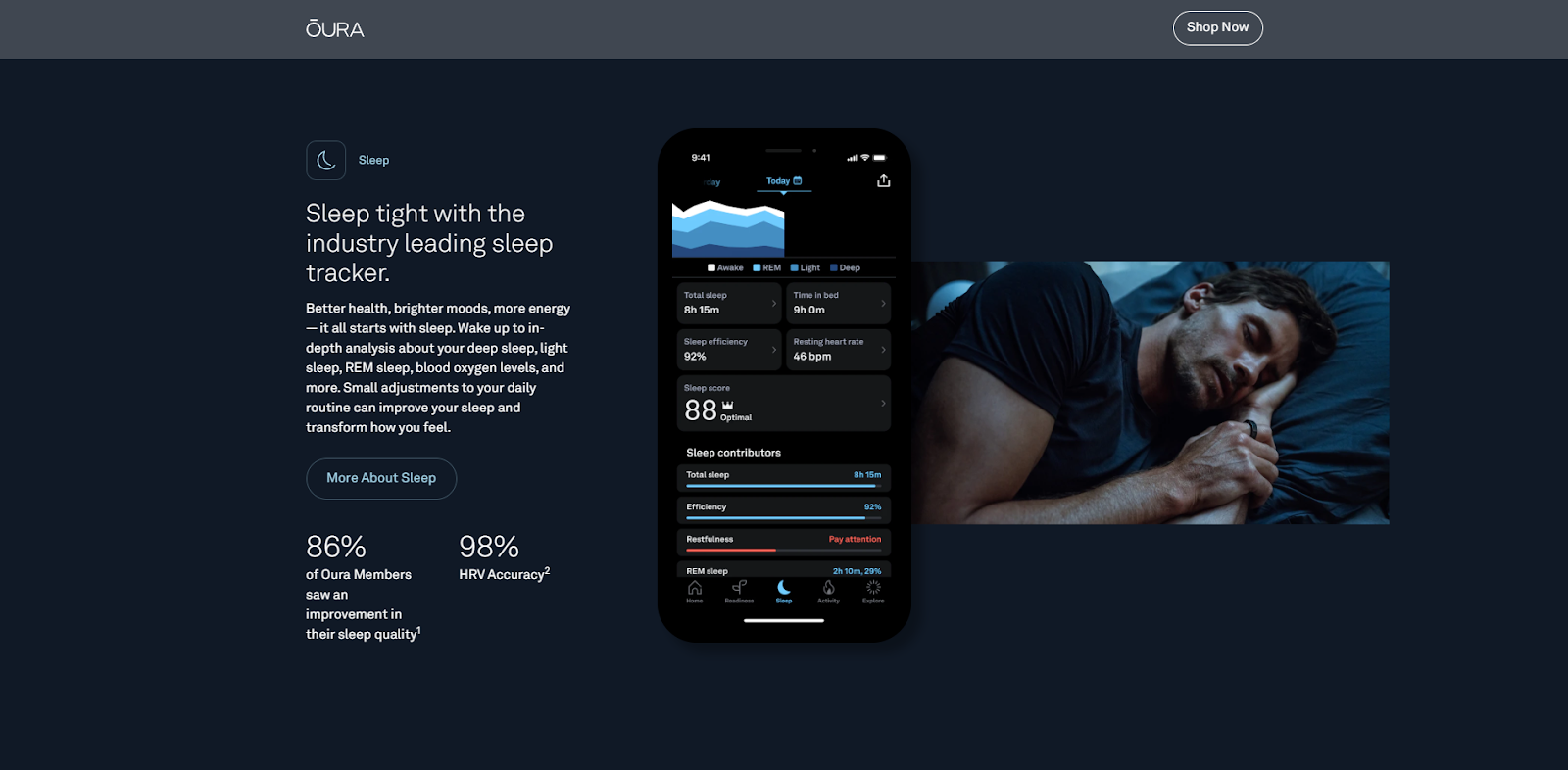
While scrolling through the page, the users are consistently given a choice to shop Oura Rings. This is presented by the floating header section, which disappears as you go down and reappears when you scroll up. This particular feature is excellent for making it easier for the user to take action if they decide to purchase the product while going through the information.

Notes to take from this website:
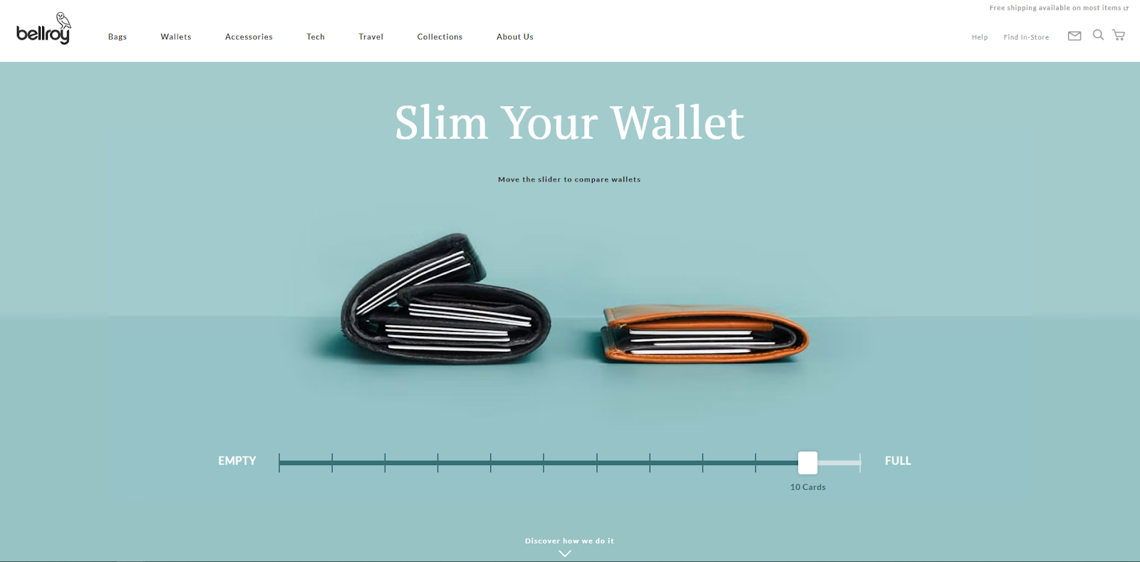
This product page is an excellent example of how you can take your product’s advantage and portray it interactively. Upon opening the page, the user can see the encouragement to slim their wallet and a couple of associative pictures below. The users can instantly understand that this product is a great alternative to a bulky and inconvenient wallet. By moving the slider left and right, the visitors can see how Bellroy’s wallet is superior to other wallets. We believe this is a fantastic way to make a strong impression on the potential customer.
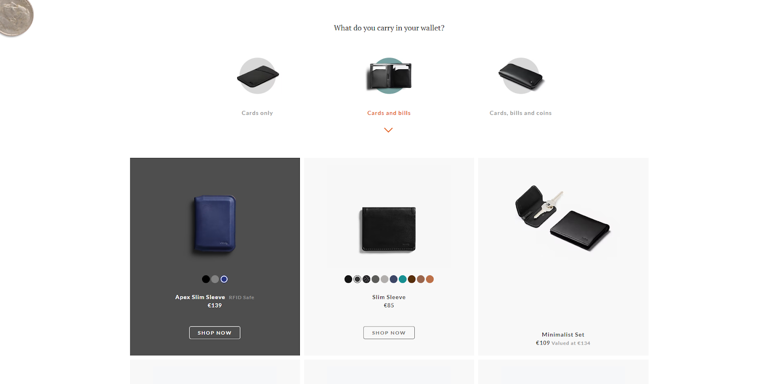
Users can scroll down to watch a video and learn more about the product. The users are also given a choice to choose the product categories, depending on what they usually carry in their wallets. Choosing one out of three categories reveals a variety of Bellroy’s products that suit the user’s choice. This section allows you to conveniently display all the available products, their respective prices, and links to purchasing them. It also makes it easier for the user to differentiate between products and helps to make a measured purchasing choice.
Notes to take from this website:
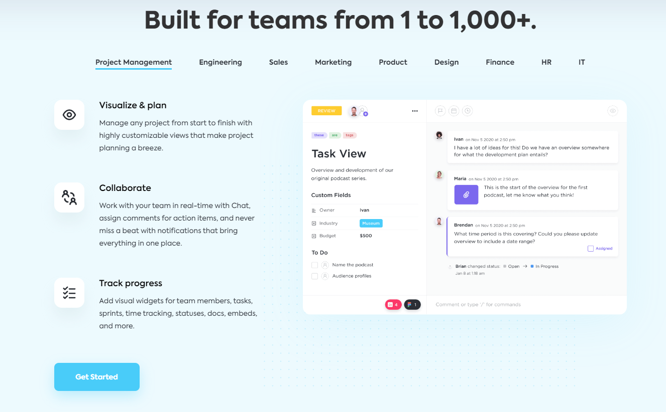
ClickUp’s product page kicks off with its selling points and calls to action. The users can see the product’s motto, a short explanation, ratings, assurance of a free product, the display of how the app works, and encouragement to sign up - all in the first look at the product page.
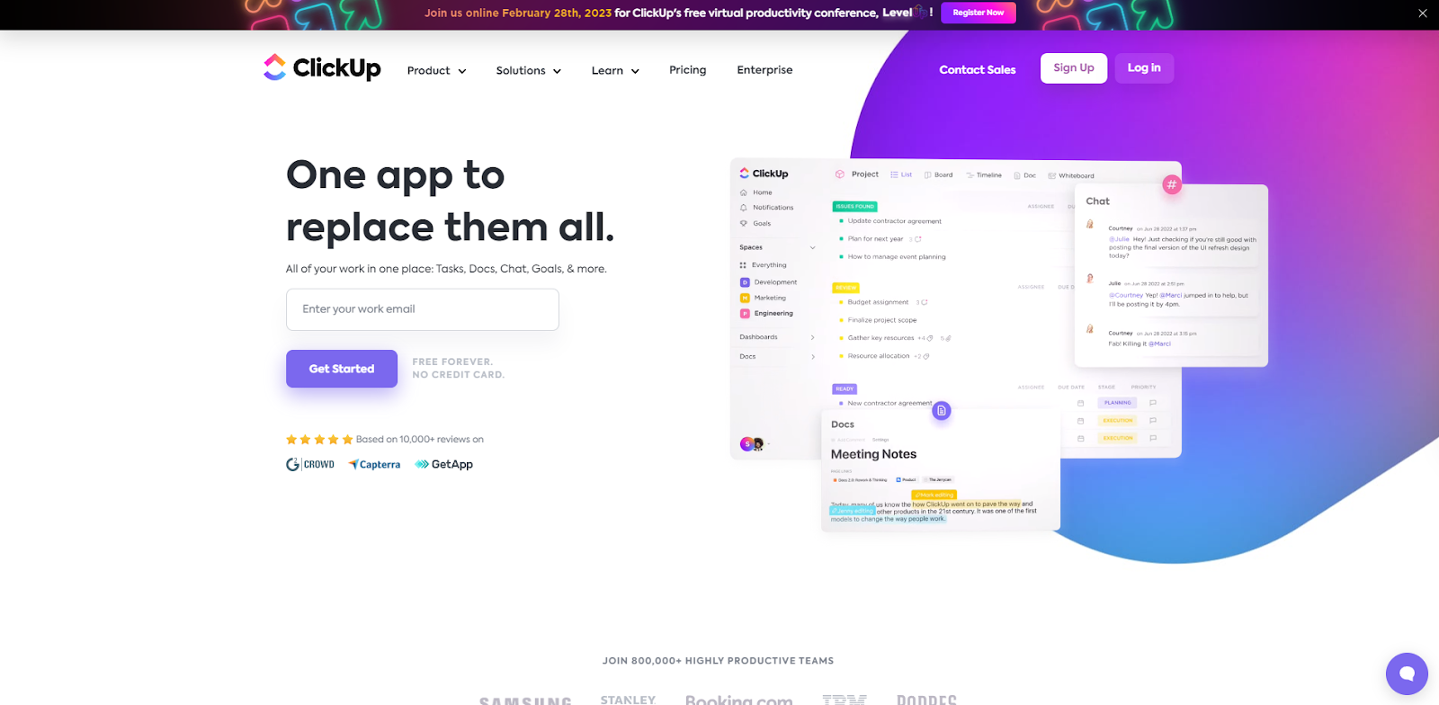
The product page also includes a call to join over 800 thousand teams, listing some of them. This helps build trust in this product and motivates visitors to become clients. Scrolling down, the users can learn more about the features which make the app special. They are introduced in different areas of interest, such as Projects or Goals. ClickUp’s available features are presented together with video information from the app. Alternative apps for performing these tasks are listed as a way to emphasize that with ClickUp, you will only need one app.
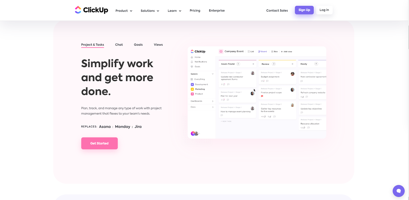
On this product page, you can also see a demonstration of how the ClickUp would be useful in different industries or company departments.
Notes to take from this website:
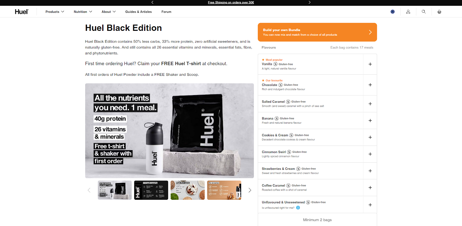
Huel is another brand that gives much attention to being as transparent and informative about its product as possible. Upon opening this product page, the users can read a short and cornice description about the product and view available flavor choices on the right. You can see a couple of the choices marked as popular or brand favorite, which can help people make an easier choice.
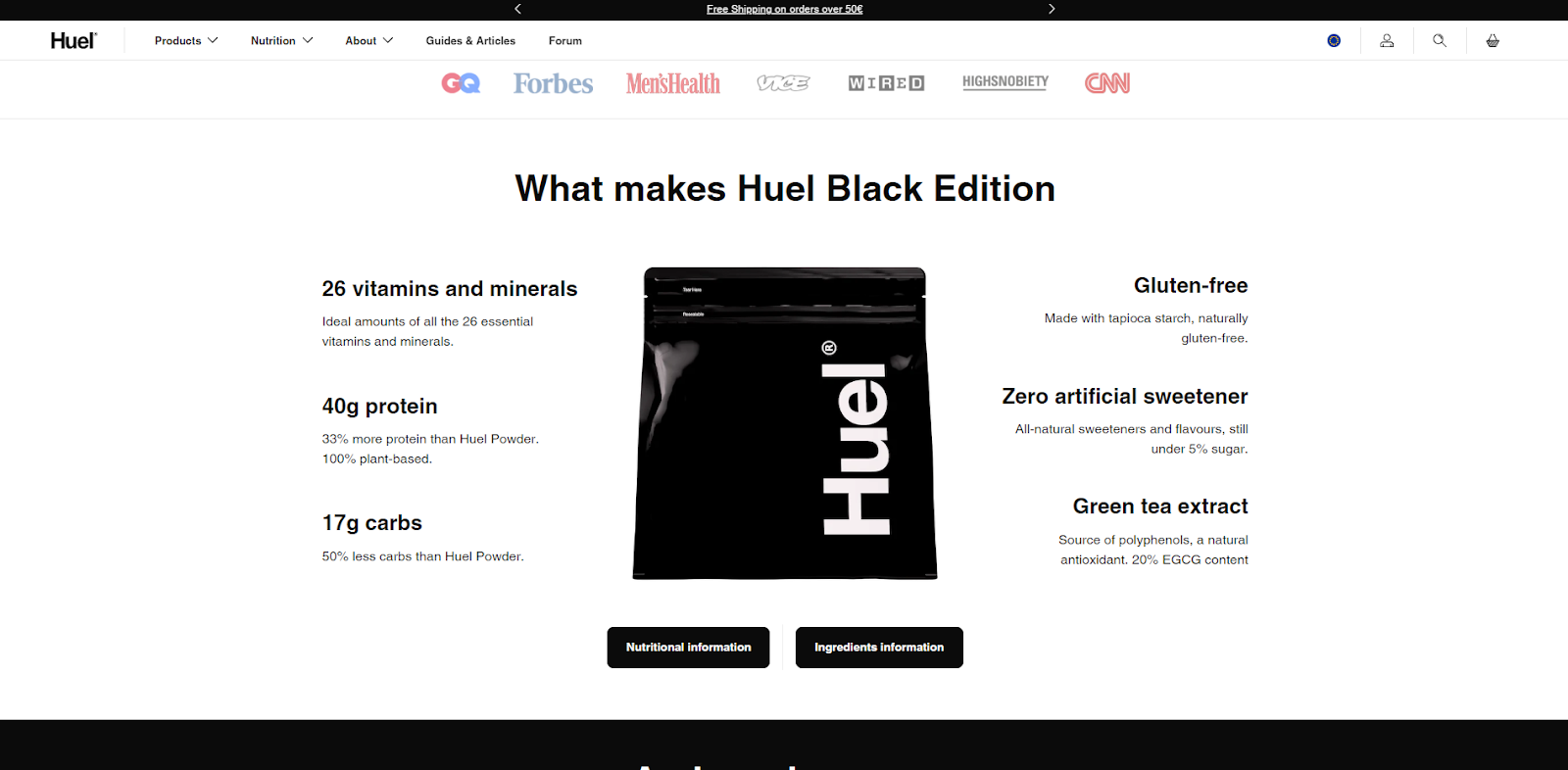
Scrolling down reveals the most important information about the product’s composition. Users can then choose to learn about nutritional or ingredient information by choosing the respective links. Additionally, below is a list of other great characteristics of this product.
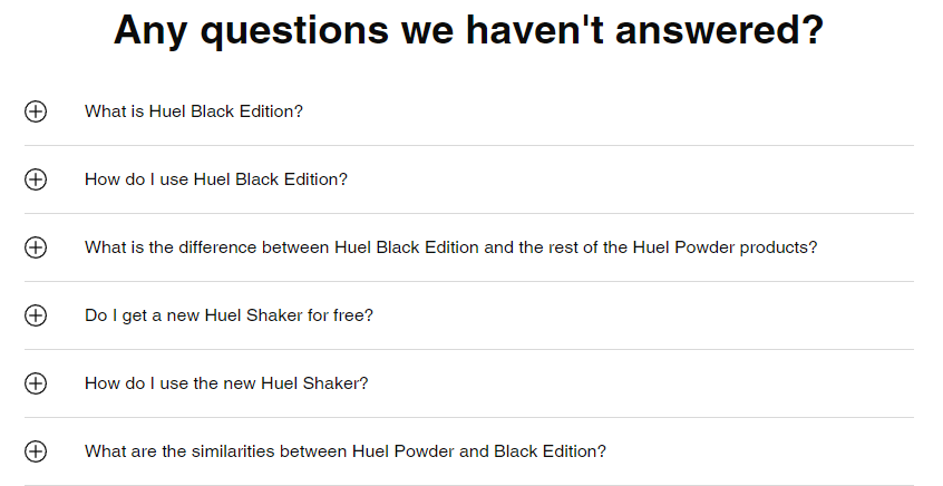
The Huel product page also includes a questions block where users can expand questions to learn the company’s answers. This block incorporates a variety of questions that seems to have been asked in the past. This shows that the brand is transparent and cares about customer feedback.
Notes to take from this website:
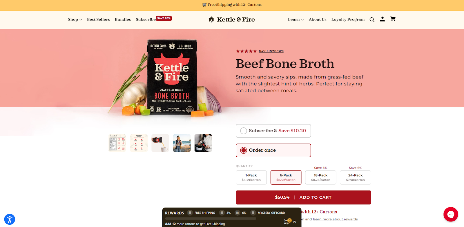
Kettle and Fire is a brand offering nutrient-filled broths created with farmers' help. Upon opening the product’s page, you can see a few high-quality photographs and a short product description. The users are given a choice to subscribe or make a one-time purchase. You can also notice that this company incorporates a rewards system, where purchasing bigger quantities results in different rewards.
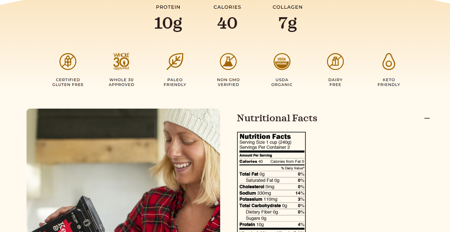
We also love how the product’s nutritional value seems to be the primary focus on this product page. Users can scroll down to learn about the product’s allergen information, nutrition facts, consumption, and ingredients. This layout helps draw users’ attention to the most important information about the product and its main selling point.
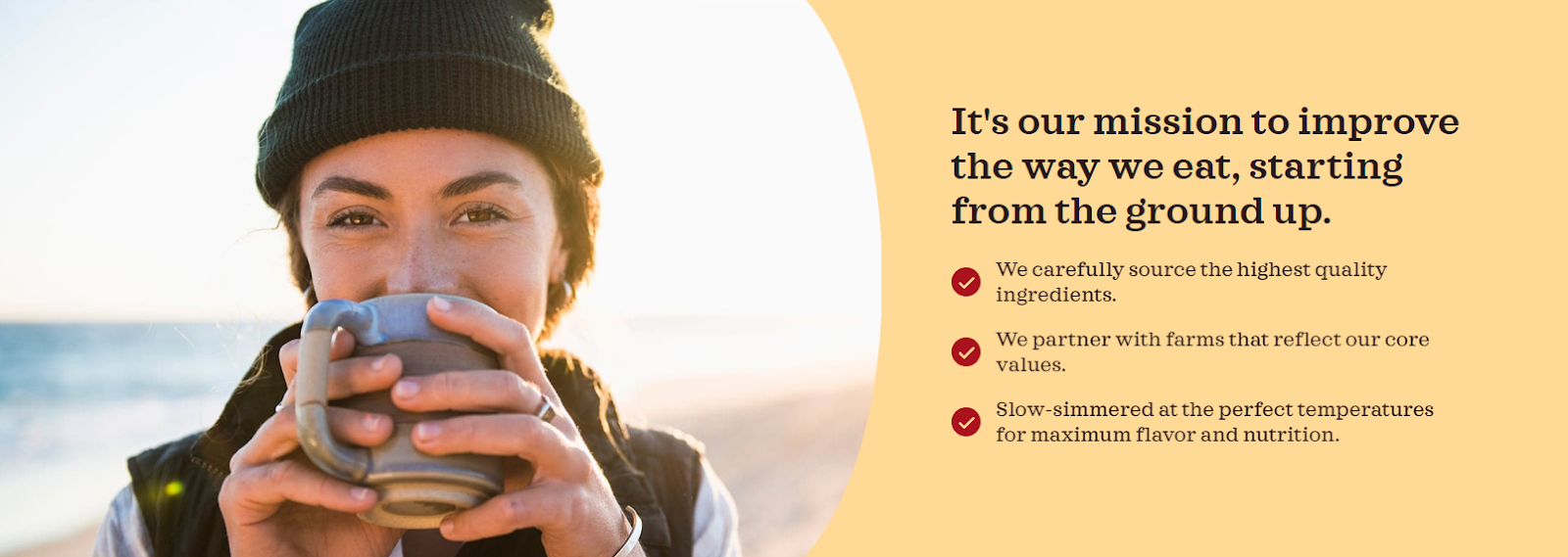
Adding the number of customers and showcasing some of the reviews from happy customers on the product page helps build trust in your brand. You can also enhance this effect by displaying your company’s values.
Notes to take from this website:
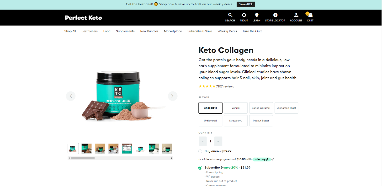
Perfect Keto displays another great example of a product page that convinces users to try the product. It features a short description of the product and its benefits. Users are also presented with multiple choices for product flavors. Choosing a flavor reveals respective product pictures on the left, helping users to make the purchasing choice.
The first time entering the page, the users are encouraged to sign up and get 15% off the price. This is an extremely effective tactic for attracting new customers, motivating them to make a purchase, and gaining data for marketing purposes.
Because this product is a rather unique supplement, we love how the brand singles out different ways people can use the product. This sets a seed in a person’s mind about potential scenarios in which the product could be useful on a daily bases.

The incorporated recipes block helps mitigate possible confusion about the product and inspires users to try the tasty recipes by purchasing the product.

There’s also an included reviews section at the bottom of the page, which stretches out for many pages.
Notes to take from this website:
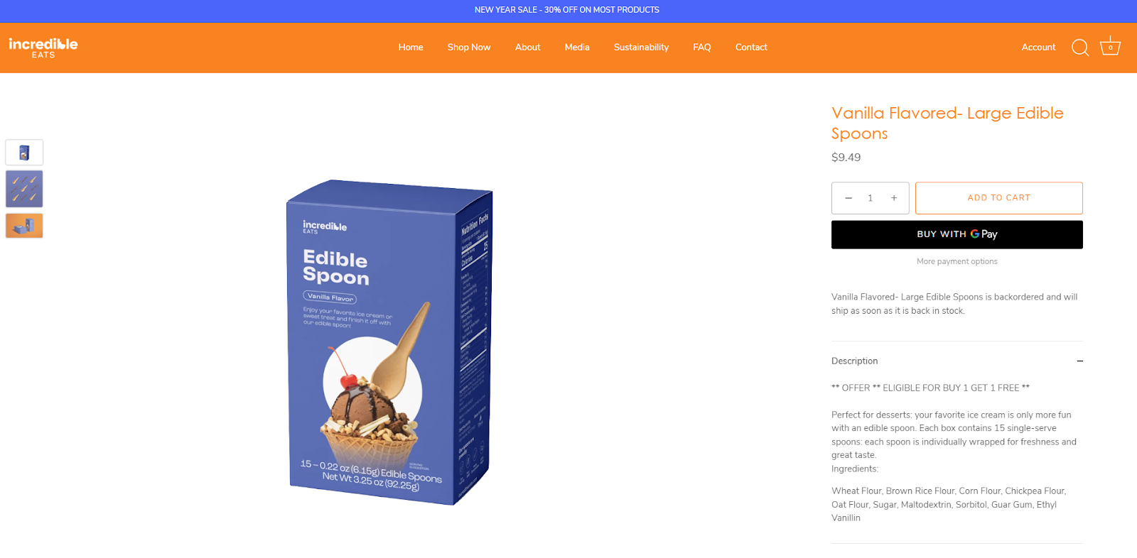
Incredibleeats is a brand that sells edible, vegan, and sustainable alternatives to utensils. It features a rather simplistic product page, which still manages to make an impact on the user. Upon entering the product page, users are introduced to the product, its usage, and its ingredients. The purchasing options are obvious and attract the visitor’s attention instantly.
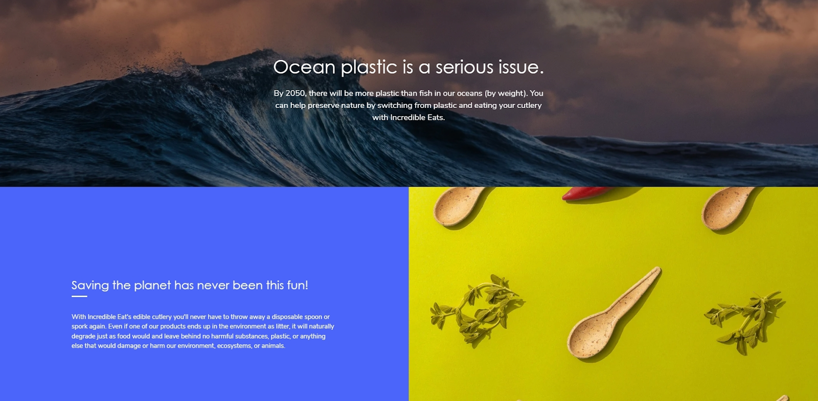
After scrolling through a couple of high-quality photographs, the users are introduced to the company’s main value and goal. The information is presented using colorful backgrounds, beautiful pictures, and concise text. We believe the choice of colors here should help keep the user interested and raise the mood.
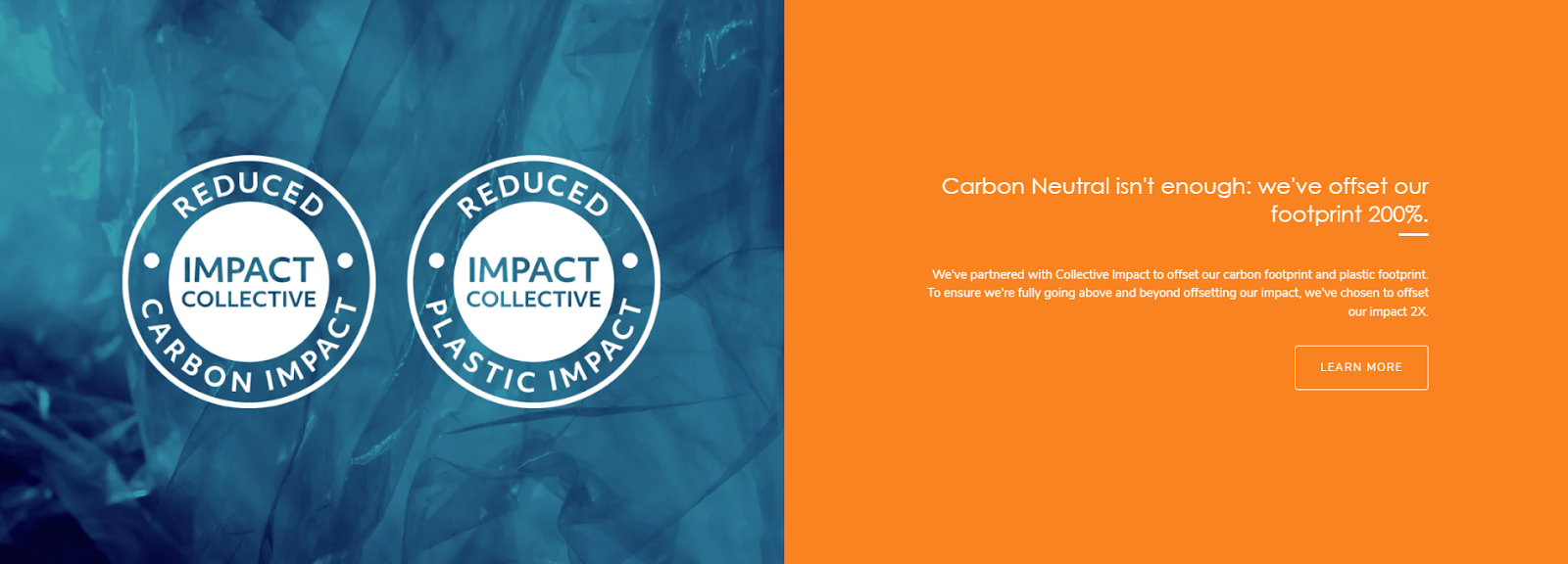
The product page also has an incorporated declaration of important partners of the brand. Not only does this section convince users about the brand’s seriousness about reaching sustainability. It also shows that this brand is trustworthy. The link to learn more allows users to find more information on how the brand is taking steps towards a more sustainable environment.
Notes to take from this website:
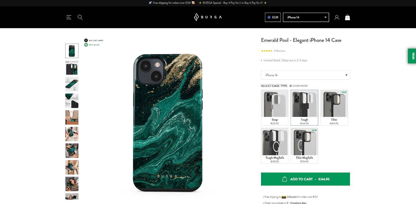
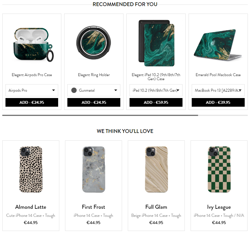
Burga is a brand offering a variety of products but is mainly known for its stunning phone cases. We immediately notice that this product page incorporates many different pictures of the product. On the right, the users can select the preferred case type, which is represented by respective pictures of different layer combinations.
The product page also includes sections that could motivate users to purchase more products. The “Recommended for you” block displays other products with the same design, which could encourage people to get the full set. The “We think you’ll love” block lists products with other designs. This block could help navigate the user in finding other attractive designs. These sections mitigate the probability that the user’s search for a product will end by checking out only one product.
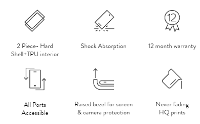
Although we believe that showcasing your product’s features with video footage is highly effective, portraying them with nice and fun icons works wonders as well. Burga proves it well by using cute icons to display the product’s powerful features on the product page.
Notes to take from this website:
Fashion Nova’s product page seems simple, but it’s highly functional. First of all, after entering this page, users can select from a wide variety of clothing sizes and specify the fit of their bodies. The size chart is also included here to make the size selection process easier for the user. We also notice an amazing feature - a bar highlighting how stretchy the particular piece of clothing is. Sometimes people can be wary about buying clothing online, as trying it on is impossible. Functions like these mitigate this worry by making a choice more precise.
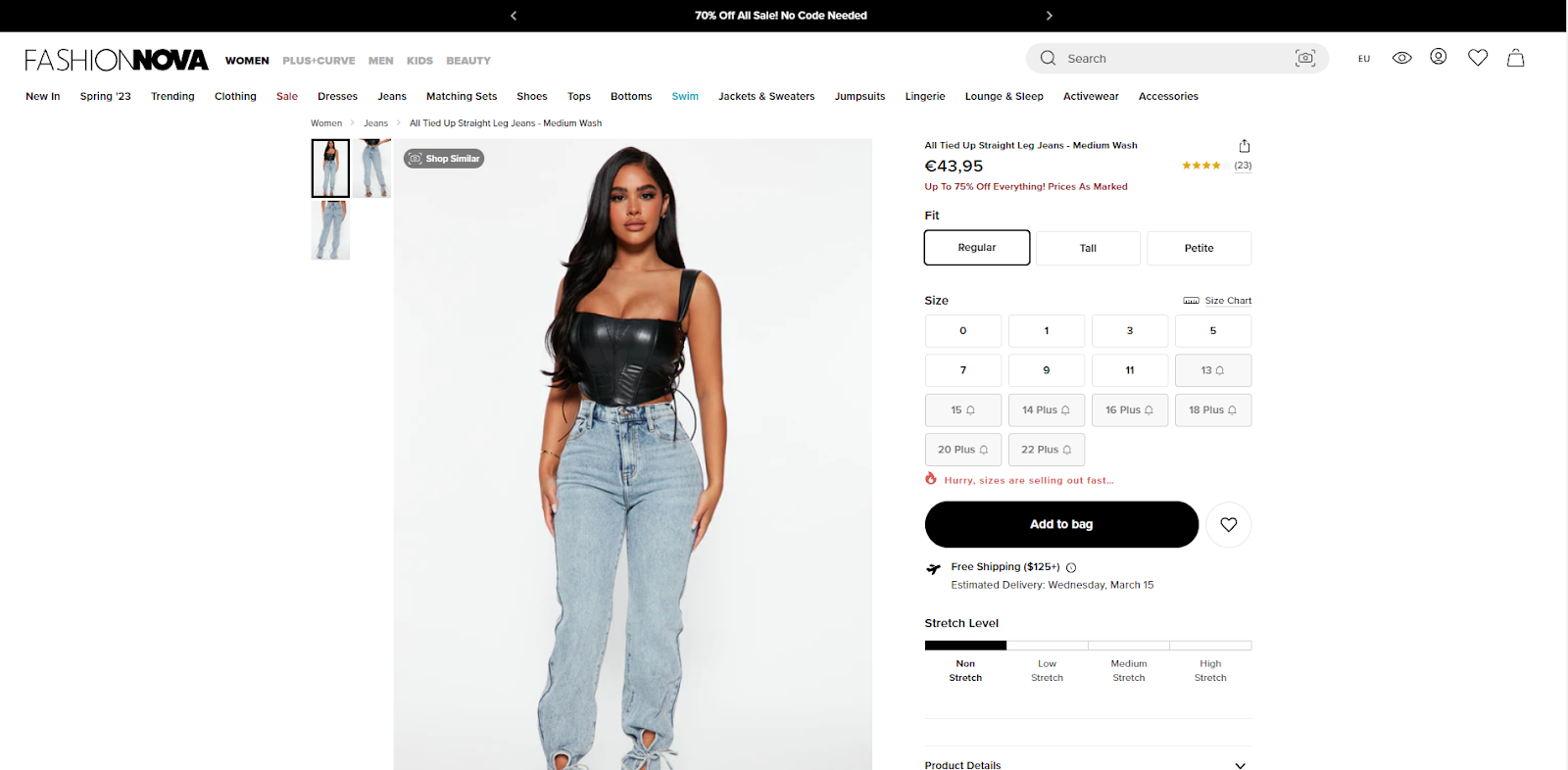
Users can then view the overall rating of the selected clothing and read some of the reviews. This section also has an incorporated slider that shows how the clothing fits the usual sizes.

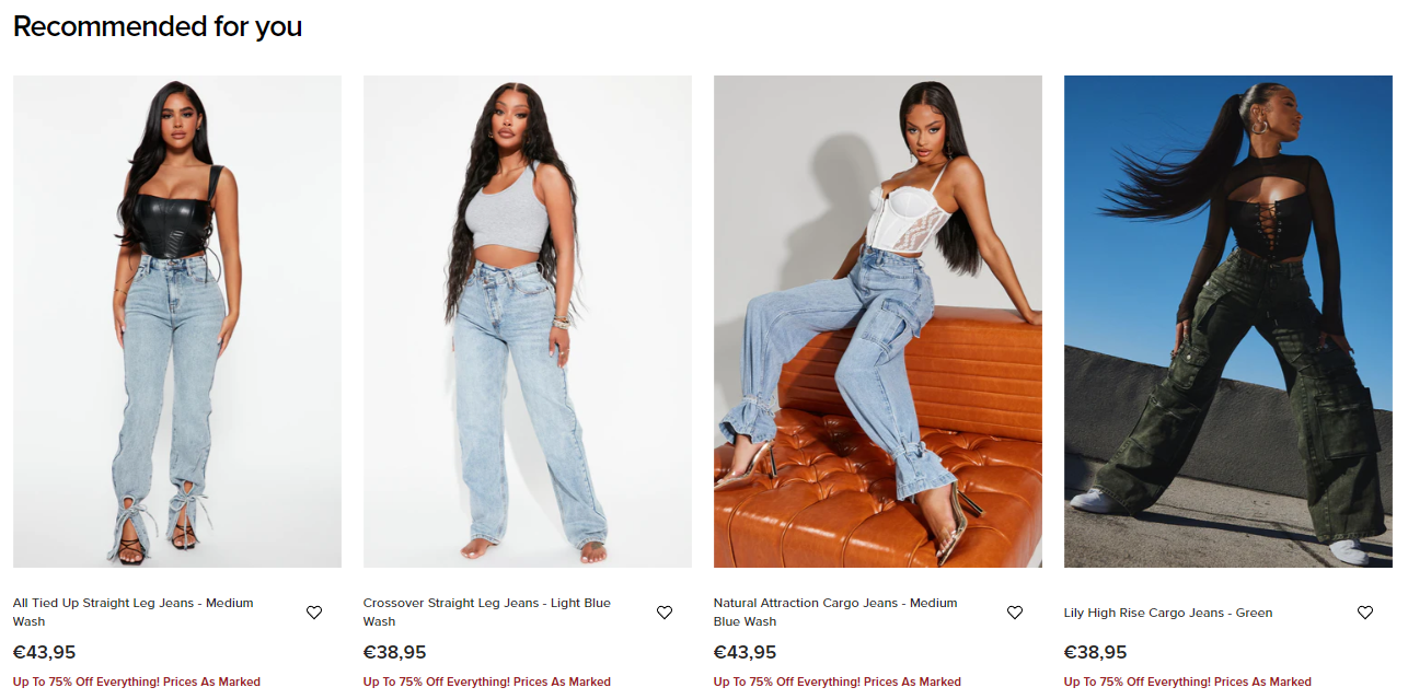
A recommendations block at the bottom of the page shows similar products in the chosen clothes category. This helps users find what they truly want by giving many suggestions in one place. It also improves the chances of the user making a purchasing choice.
Notes to take from this website:
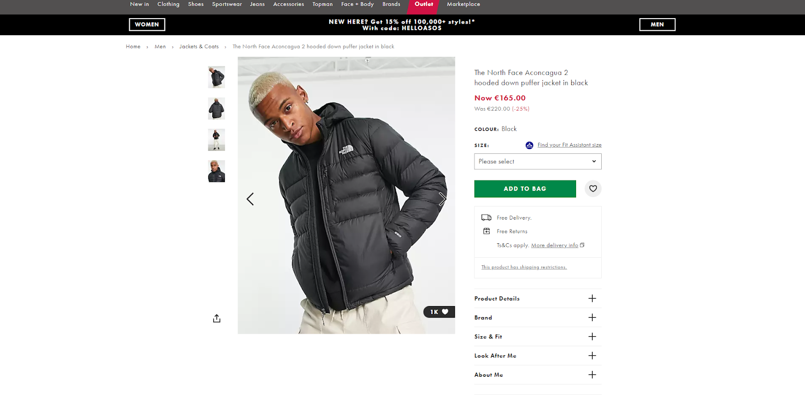
You will notice that Asos similarly tries to give potential customers as much information about the product but does it a little differently. On the Asos product page, information about the product, brand, size and fit, product care, and materials can be found in different groups that can be expanded by clicking a plus sign. Not only does this allow providing more information to the user, but it also helps do it in an organized way.
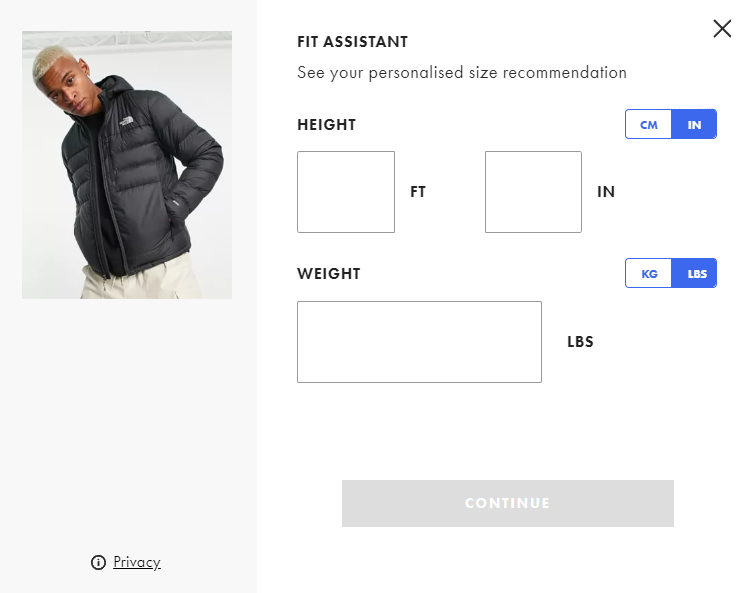
There’s also a sizing help block to help potential customers choose the clothing size better. After clicking for help, the fit assistant pops out. Users are then asked to enter their height and weight and select tummy shape, chest shape, age, and fit preference. After some calculations, users are shown the recommended size for them. We believe it’s a handy tool to add to your product page if you sell clothing.

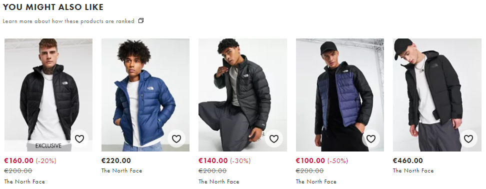
This product page also has a recommendations block with various similar items. We already discussed the benefits of adding this kind of section, but we want to point out something different here. None of the items have product names, making viewing them less distracting. There’s also a link to learn more about how the products are selected for recommendation.
Notes to take from this website:
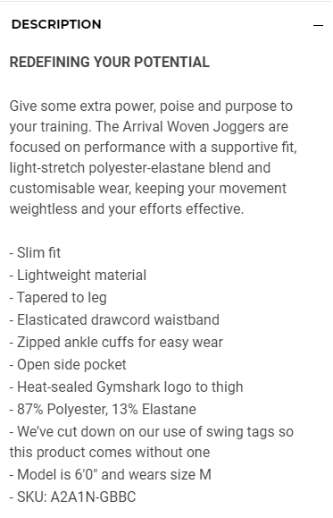
Gymshark is a well-known brand of sports clothing. We immediately notice that Gymshark’s product page has a very compact layout and doesn’t provide many information for the user. Users can select the product's color and size upon entering a page. A size guide is included near the size selection but is rather simplistic. We think the ability to add an item to a wishlist is a great option because it reminds people about their products of interest. Gymshark also provides the ability to pay for the items in installments. It shows that the brand is ready to suit the different needs of its customers.
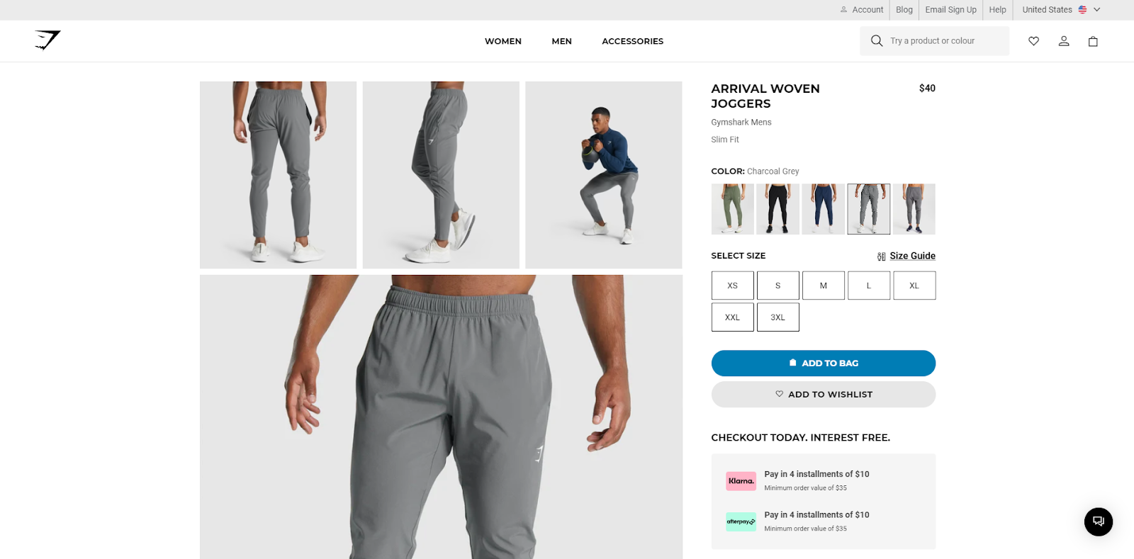
We would also like to commend the choice of photographs on the product page. They portray the product characteristics that are most important for potential customers. This helps the users better imagine how the product would feel and look on the body during an exercise.
Nevertheless, we believe there could be a more attractive way to display all the information about the product. This format, in particular, doesn’t look eye-catching and can be easily overlooked.
Notes to take from this website:
GFuel’s product page features a funky design, just like its product packages. It shows great unity and helps improve the mood of the visitors. Once entered, the product page displays a choice to make a one-time purchase or subscribe to save money. It is nice how the buttons associated with purchasing all have a different colored background. Users can learn more information about the product by clicking appropriate grouped sections.
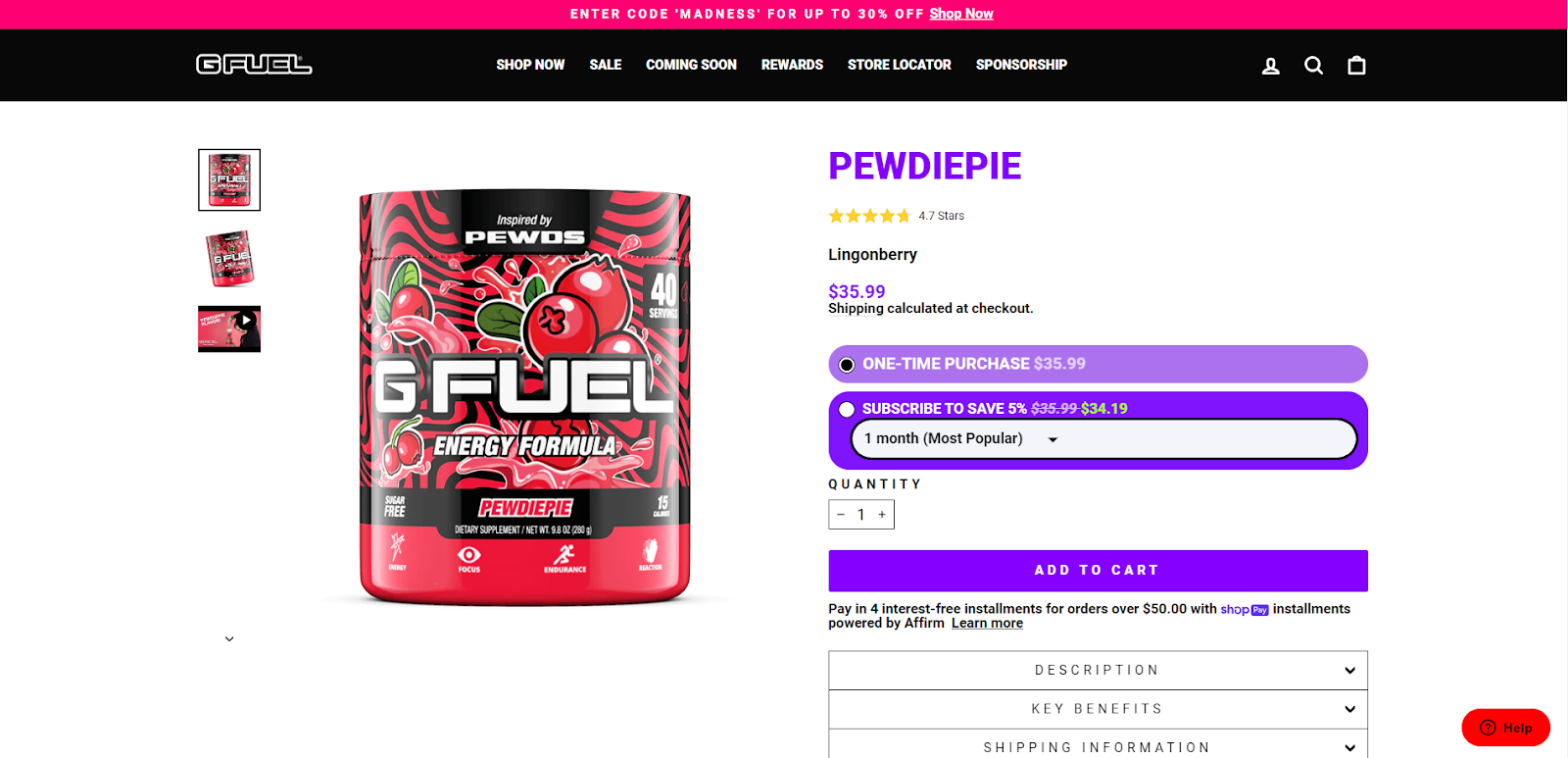
Below, the users can see a few of the social media icons encouraging them to share about this product. This is a rather unique way of prompting your customers to advertise your product for you.

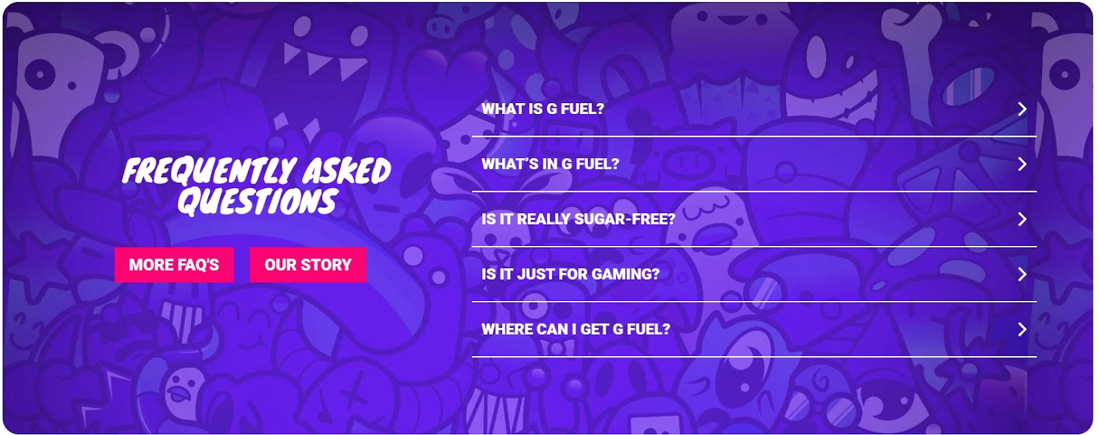
We also adore the FAQ block incorporated into GFuel’s product page. It has an eye-catching background and provides users with the most important information in a concise manner. Who said the FAQ block has to look boring?
Considering that people do not always people turn to e-stores for their shopping, it’s a great decision to emphasize where your products can be found in physical stores.

Notes to take from this website:
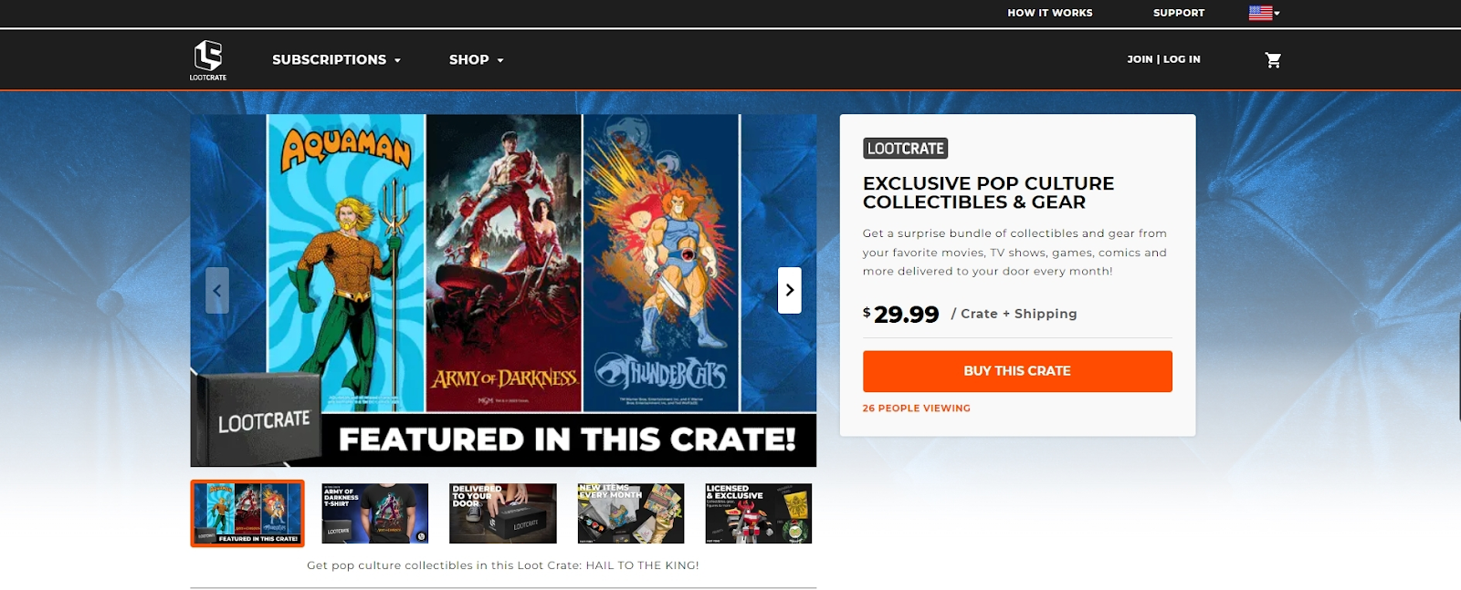
LootCrate offers crates for almost every movie, game, or comic geek. The product page here is extremely simple and not overloaded with too much information. There’s a bright orange button encouraging visitors to purchase the crate. Users are also informed about how many people are currently viewing the same product. This shows that the product is desirable and can motivate users to commit to purchasing.
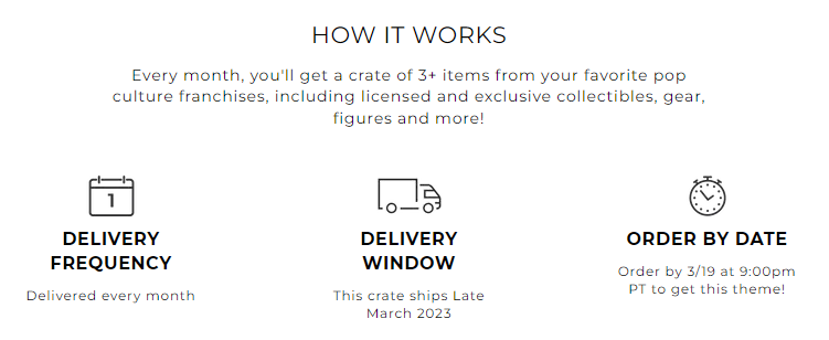
We think it is essential to provide potential customers with as much information as possible to decrease confusion. That is why adding an in-depth explanation of how your product works is an excellent way to attract customers and inspire trust in your brand. LootCrates does this very well, not only by explaining the whole process but also by adding nice associative icons.
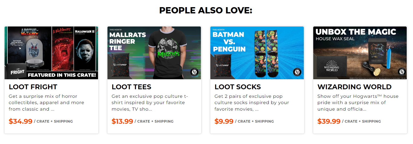
The LootCrate product page also has an incorporated recommendations block that helps navigate users to similar products. Naming this section ‘People also love’ is a powerful way to show that the customers like your brand and that making the purchase will not disappoint.
Notes to take from this website:
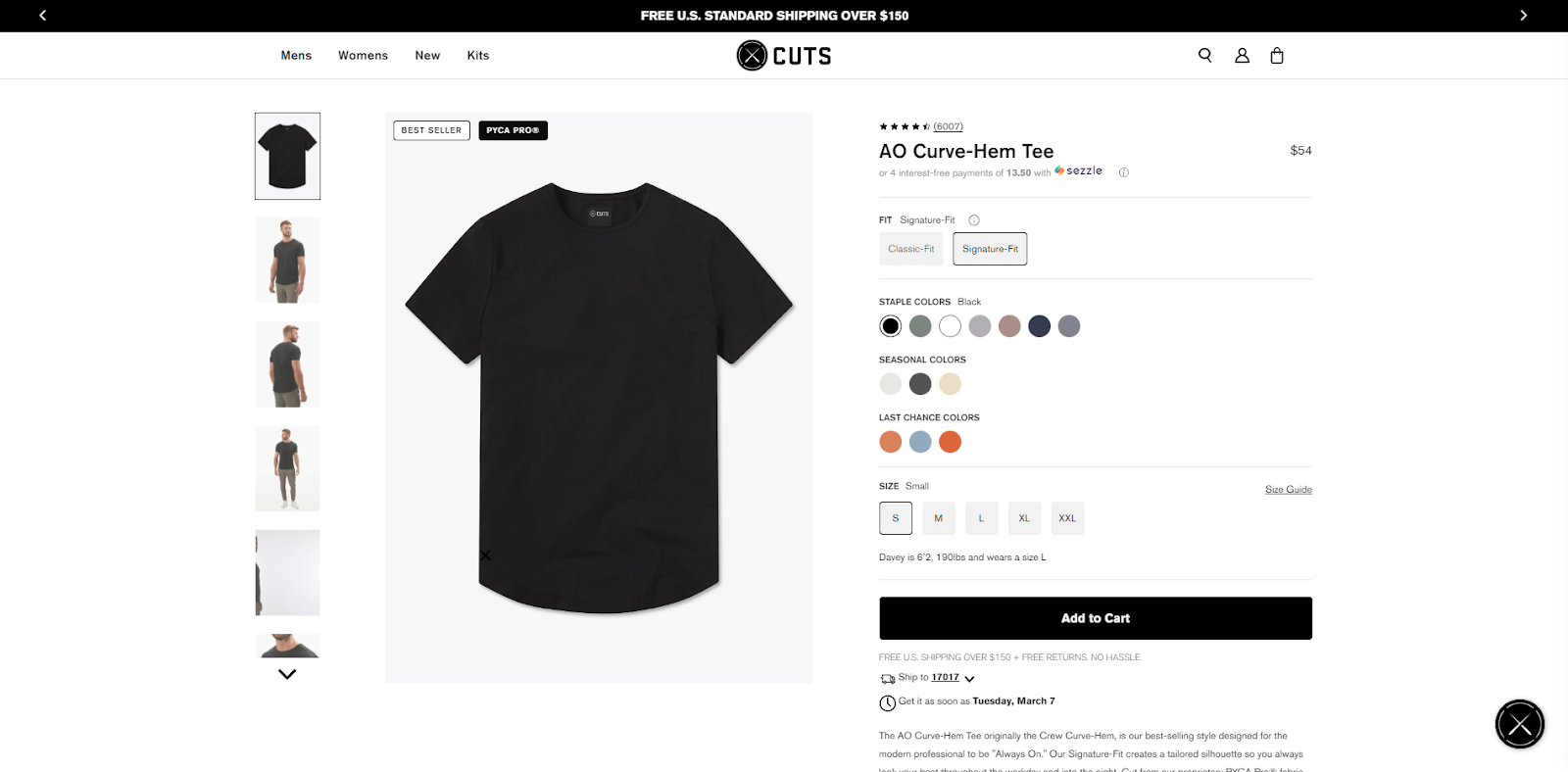
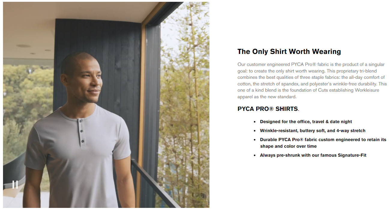
The CutsClothing product page gives a wide variety of choices for its products. The colors are nicely divided into groups, making choosing easier for potential customers. Below the adding to cart button, users can enter their zip code and see when the product would arrive if they were to purchase it. It is extremely helpful for people to know this information instantly and not at the last steps of the purchase.
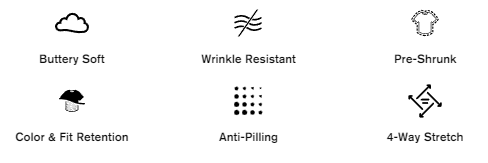
CutsClothing also chooses an excellent way to emphasize its product’s characteristics in an eye-catching way. Singling them out in a separate section and combining them with cute icons ensures that the user will not miss this information.
It is important to understand where your product stands in the market. When we’re talking about clothes, it is difficult to really stand out. That is why, if your product has unique features, be sure to effectively inform potential customers about it. CutsClothing fulfills this thought well by adding a section explaining why the product is exclusive.
Notes to take from this website:
GetJoggy features an extremely attention-grabbing product page that instantly sets the mood. The spinning product image definitely works wonders in hypnotizing the visitors to learn more about it. On the right, users can see the usual short description and options for purchasing.
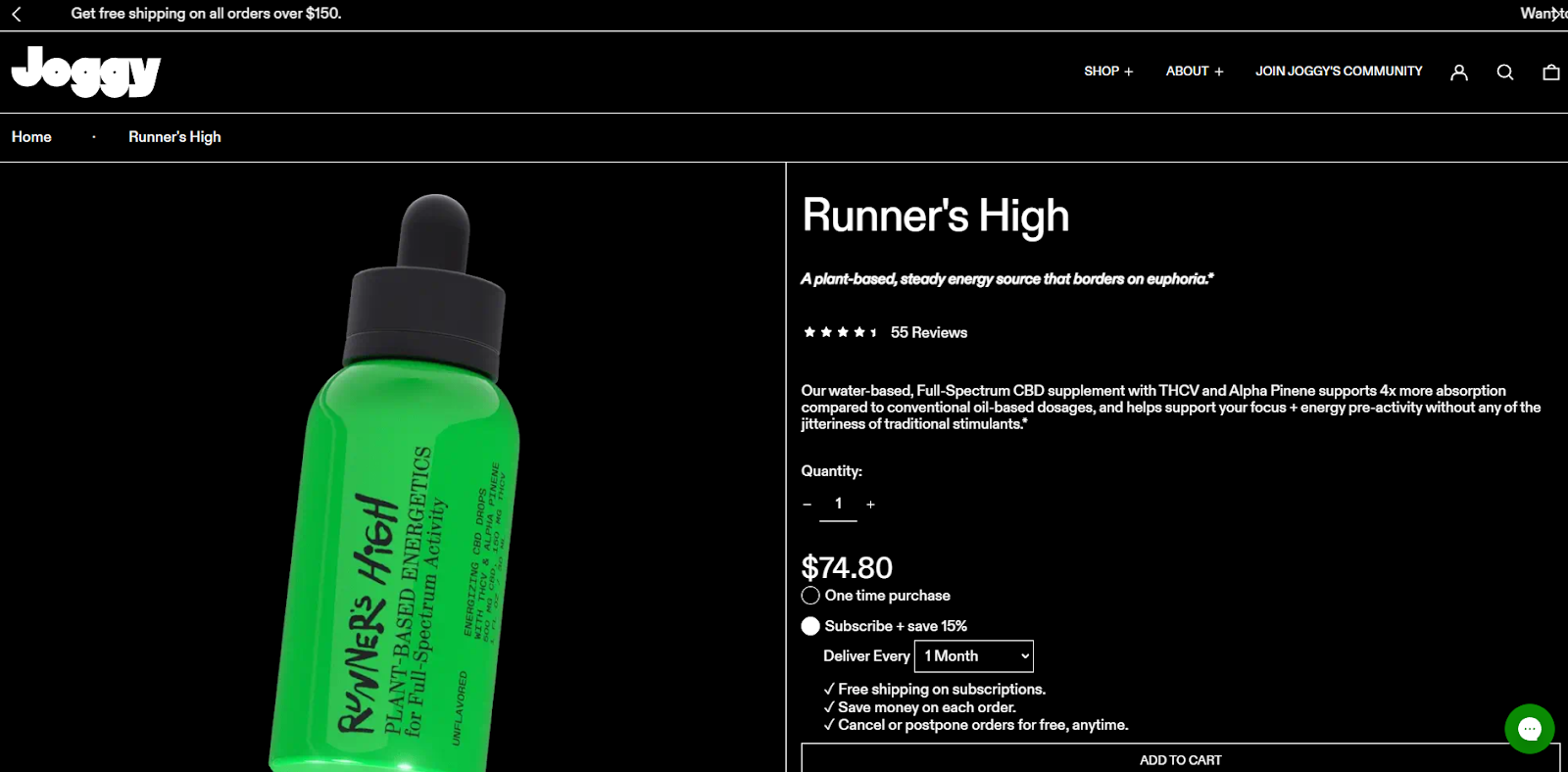
Scrolling down reveals a little more information while still showing images of the product. There’s a section for showing similar or complementary products and a few grouped sections. Users can read more about the product, its usage, benefits, and even way of recycling by expanding the appropriate sections. This kind of organized layout helps make an already visually strong product page less distracting.
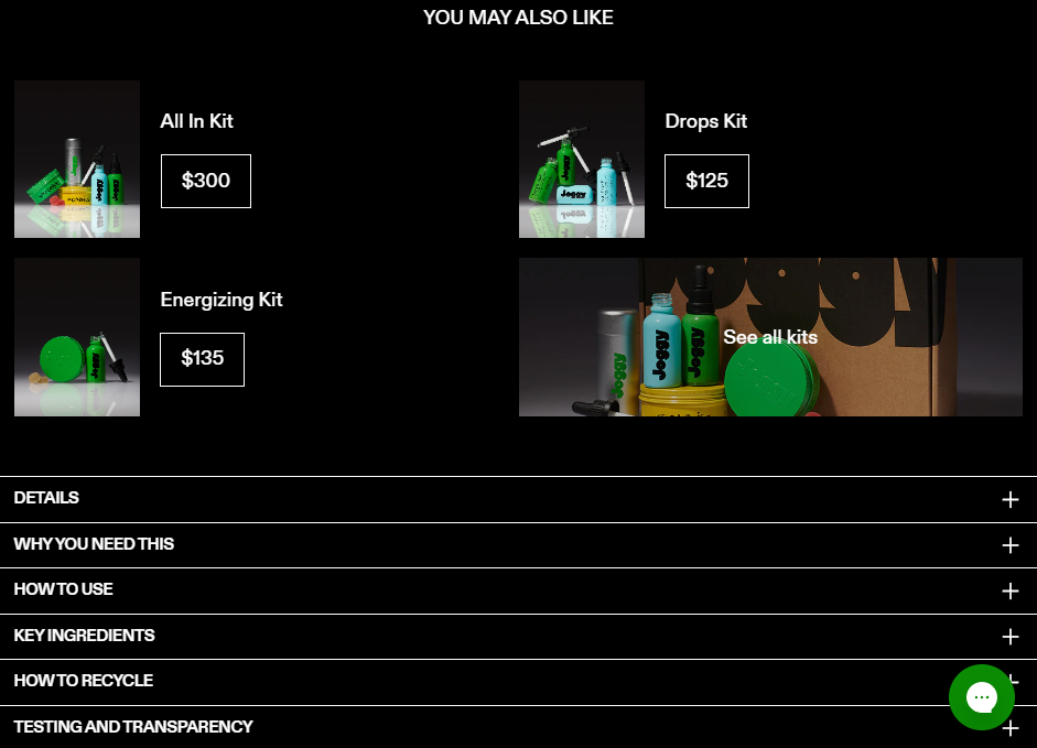
Below, users are also informed about what makes Joggy different. Excluding your original or unique product characteristics can make a huge difference in the user’s choice to purchase your product. It sets you out from the crowd and can convince people to take a leap of faith even if they knew nothing about your brand in the first place.

Notes to take from this website:
The Ridge offers modern and non-traditional wallets, key cases, and other similar products intended to make your life easier. At first glance, Ridge’s product page looks neat and organized, just like its wallets. A few photographs of the product are displayed, and users can learn more information by clicking on the grouped sections.
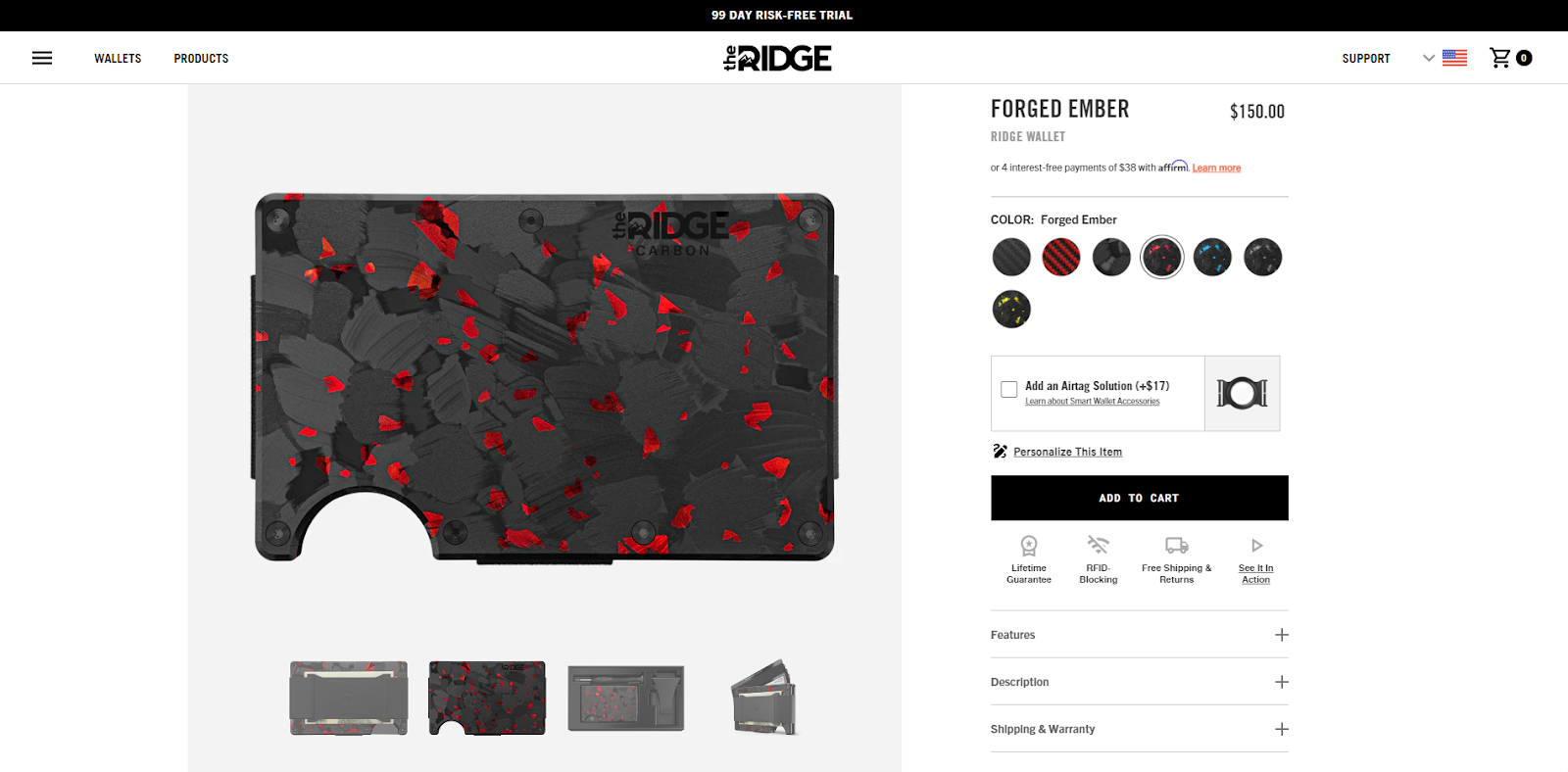
Scrolling down, the product page includes a smoothly moving image of cards sliding out of the Ridge wallet. It is a great way to showcase how your product works and induce visitors’ curiosity. This section also displays the main product’s characteristics.
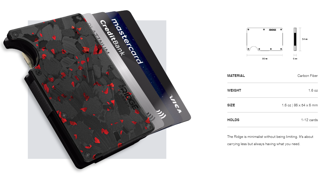
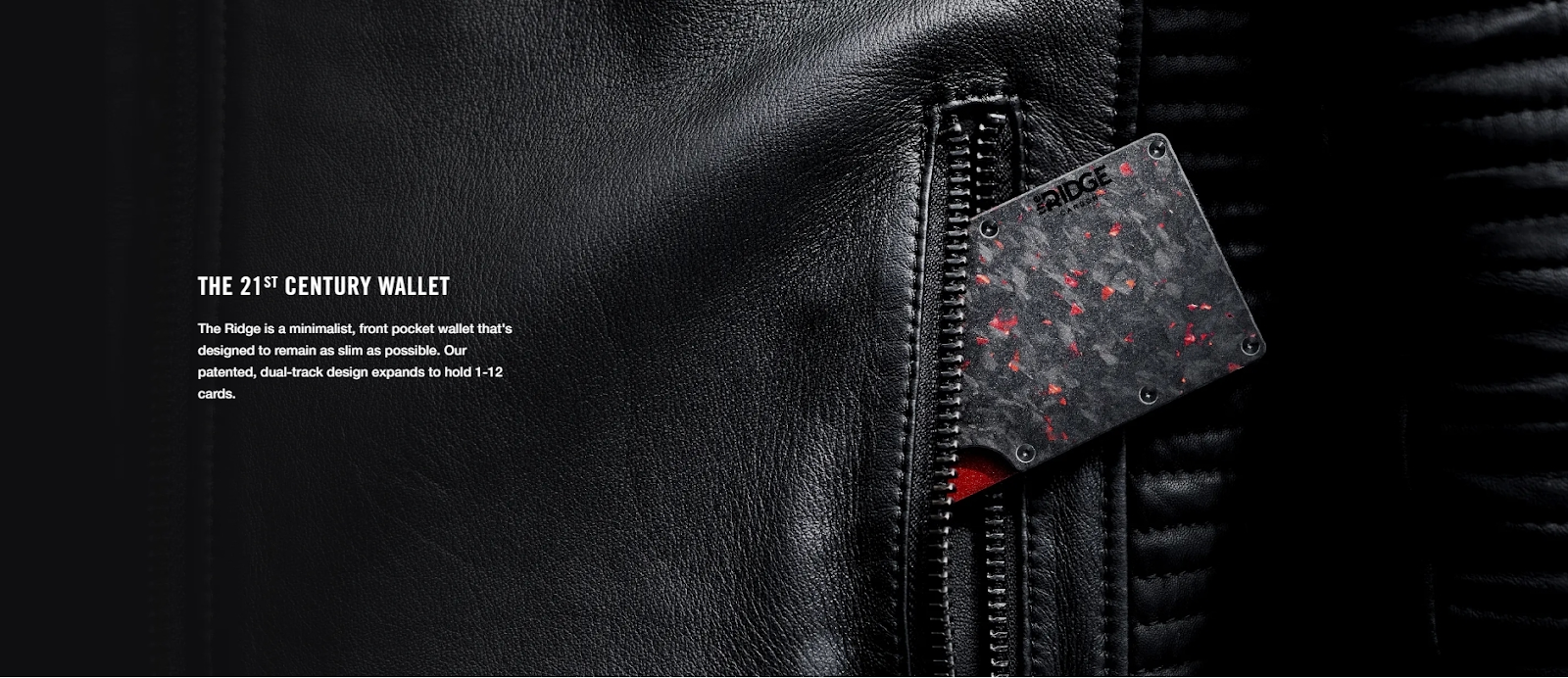
We believe one of the most persuasive ways to introduce your product is showing how a person would be using the product or how it would look in natural everyday surroundings. The Ridge does it well by incorporating high-quality, zoomed-in product photographs throughout the page.
Notes to take from this website:
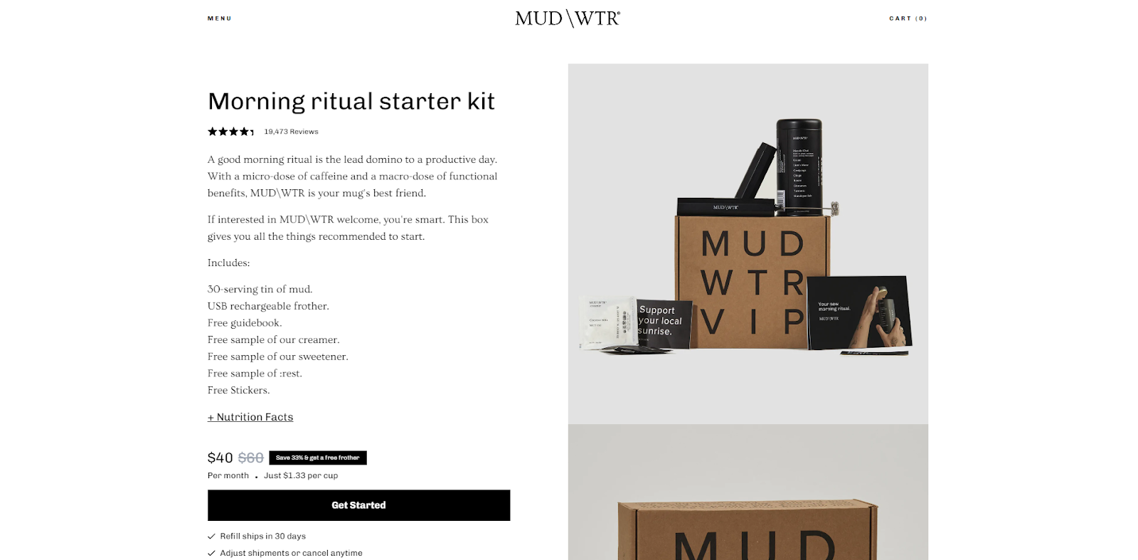
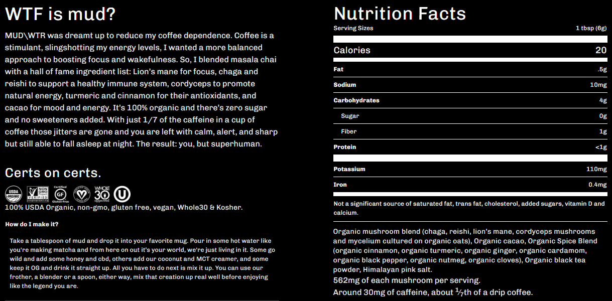
The MUD\WTR features a somewhat different product page layout that is rather elegant and minimalistic but instantly catches your attention. Straight-off users are introduced to the product and what it includes. The nutrition facts are also incorporated in this section, as they appear to be one of the most important parts of this product.
After scrolling through a few photographs, users can see a catchy phrase and an explanation about the product’s ingredients. In a way, it portrays the brand’s values and shows that its transparent about the product. We also love how the product’s ingredients are revealed one by one, combined with the associated pictures and place of origin.
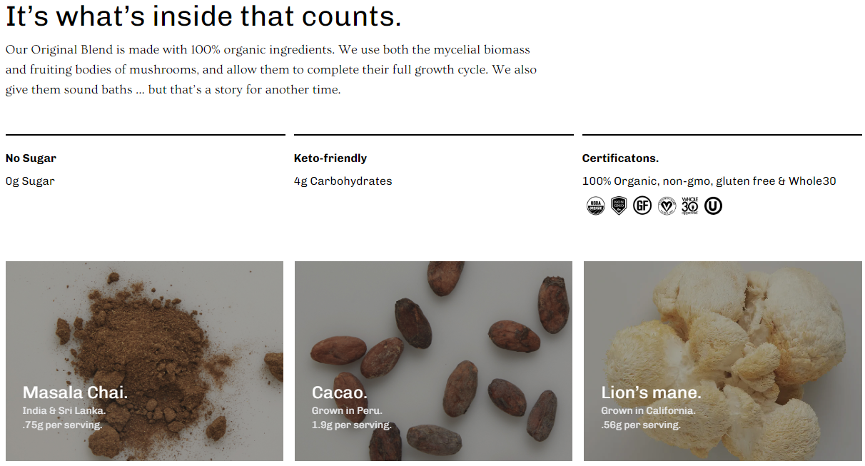
Scrolling down a bit further, users can find a more detailed description of the product, all the certifications, an explanation of the creation process, and its nutrition facts. All this information is displayed in a well-contrasting background, symbolizing that users must read this section.
Notes to take from this website:
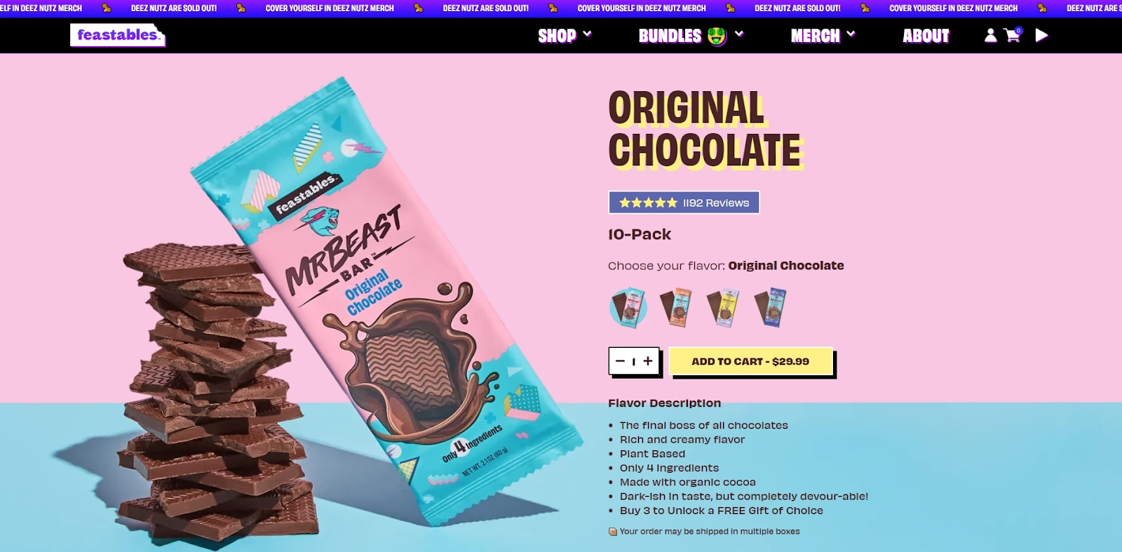
The Feastables product page is sweet and cute looking, just like their product packaging. It perfectly shows how to connect your page design to complement your product. The page design is definitely eye-catching and stimulates the user’s chocolate cravings. We would like to point out that providing users the ability to choose the flavor by picking out different chocolate icons is a great alternative to simply listing the flavors. The flavor description is fun and instantly separates the product from the others.
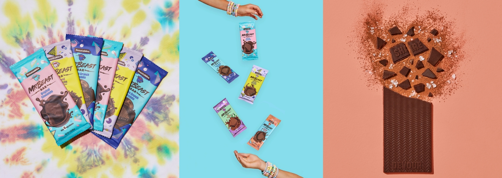
Beautiful and fun photographs incorporated in the product page do a great job of lifting the visitor’s mood. Their only purpose here is to set the mood and stimulate chocolate cravings in people, which is an important task when it comes to sweets.
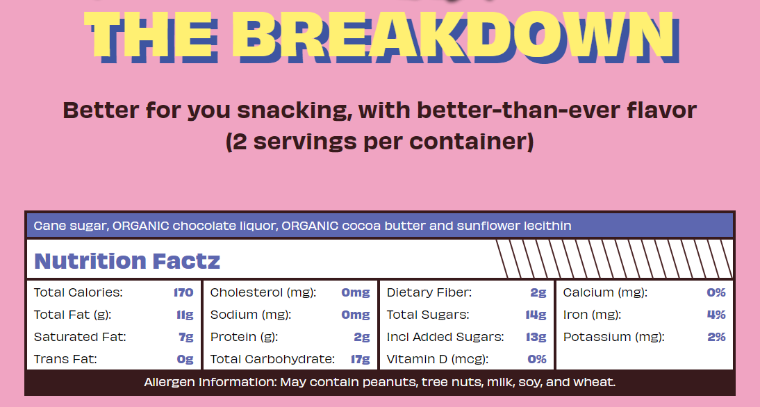
The product breakdown looks fun and interesting as well. It is presented in an attention-grabbing way, and the reason behind this decision is clear after reading the chocolate’s nutrition facts. It is obvious that the brand wants visitors to read this section carefully as it showcases that the Feastables chocolate is far superior and healthier than others. We are guessing that the chocolate’s nutrition facts are the main selling point that should be the most convincing.
Notes to take from this website:
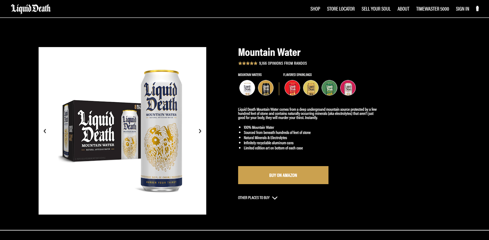
The Liquid Death’s product page also chooses to represent different product flavors with tiny product images. Users are instantly introduced to the product description and a few strong points about what makes it special. This product page features a black background, which helps set the mood and makes the text extremely easy to read.
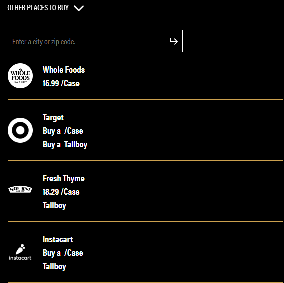
As we’ve mentioned before, informing the visitors where they can buy your product in physical stores is a great decision. Liquid Death allows users to enter their location and reveals which local stores may have their product. This is a great way to present personalized information and help users get more aware of your product the next time they visit those stores.
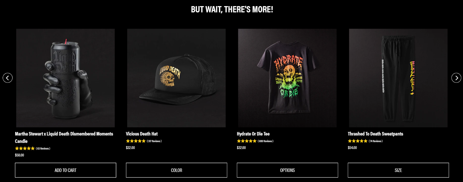
Users can also find the recommendations block at the bottom of the page. A catchy phrase ensures that the section won’t be missed while scrolling through the product page. We also like how the recommended products are from different product categories. It follows the scenario that the person has already decided to purchase a drink but may be interested in the Liquid Death hat.
Notes to take from this website:
The Dollar Shave Club features a rather simplistic design and a non-overloaded layout. The product information is presented on the right, explaining why the visitor needs this product. The benefits and strong features of the shave gel are singled out and displayed as a checklist. This kind of format instantly attracts visitors' attention as they enter the product page.
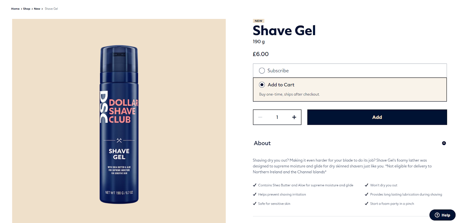
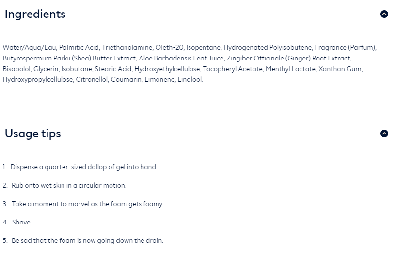
Scrolling down, the users can expand sections to learn more information about the product’s ingredients and usage. Overall, the information provided on this product page is concise and simple, just like the product itself.
Notes to take from this website:
We’re finishing our list with a strong product page example from Vacation Inc. Users will instantly notice a unique design that, combined with the photographs, creates an old-school feeling. The product is displayed as a spinning object, which is an excellent way to showcase how your product looks. Basic product details are included on the right in a different colored background to make it more visible. This is a great example of how to present all the information the user might need at the first look at the page.
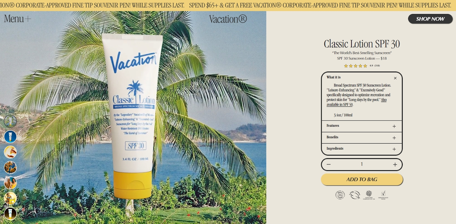
This product page also includes a declaration that the product is dermatologist approved and developed with the help of professionals. It inspires trust in the product and helps to convince the user of its quality.

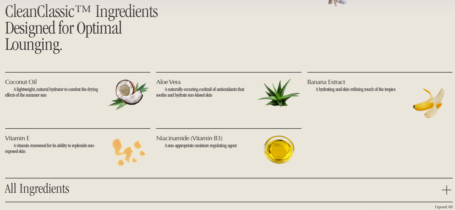
We also like how the product’s ingredients are presented on this page. Listing each ingredient, including a short description and a tiny picture of it, helps bring the user’s attention to it. If needed, the users are given a choice to learn about all ingredients.
Notes to take from this website:
In conclusion, the best product page examples will have all the necessary features to grab and keep the customer's attention, ensure a smooth buying experience, and make the product page functional.
To be successful, the page must include eye-catching visuals, comprehensive and clear product descriptions, social proof such as reviews, a secure payment system, and easy navigation.