Do you wish to create a website for your videography business? Having an online presence is essential in this digital age.
We believe a powerful website can work wonders in showcasing your artistry and attracting new customers.
In this article, we will discuss how to create a website that reflects the quality of your work and helps you stand out from the competition.
We will look at essential considerations such as design elements and layouts and helpful tips for creating an effective website for your videography business.
Best Videography Websites Examples

Brighter Lights Media
URL: https://brighterlightsmedia.com/
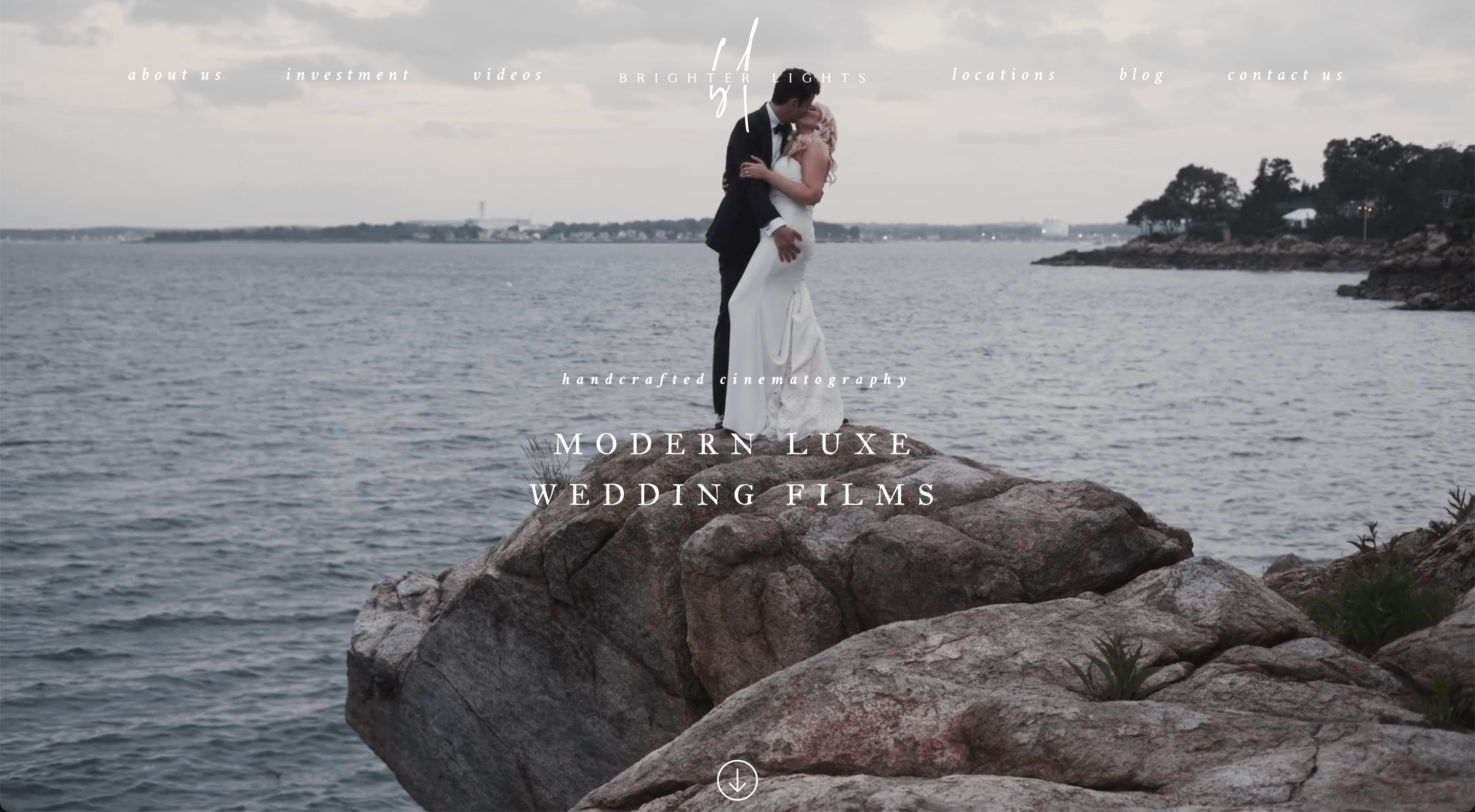
The Brighter Lights Media website features a front-page video showing moments from various events. It instantly informs the user that the business’s main area of expertise is weddings. Below the video, there’s a short description included with polaroid-like pictures. There’s also an included slideshow of featured videos.
This section is great for giving visitors a sneak into your work and showcasing its quality. What we like about this website is the service packages displayed on the front page. It provides users with the most important information without them having to go through the contacting process.
Notes to take from this website:
- Display all the essential information about the available services;
- It helps to build a design that directly corresponds with your portfolio’s theme;
- Incorporate moments from your finished videos.
Builder used: WordPress

Ashirov Media
URL: https://www.ashirovmedia.com/
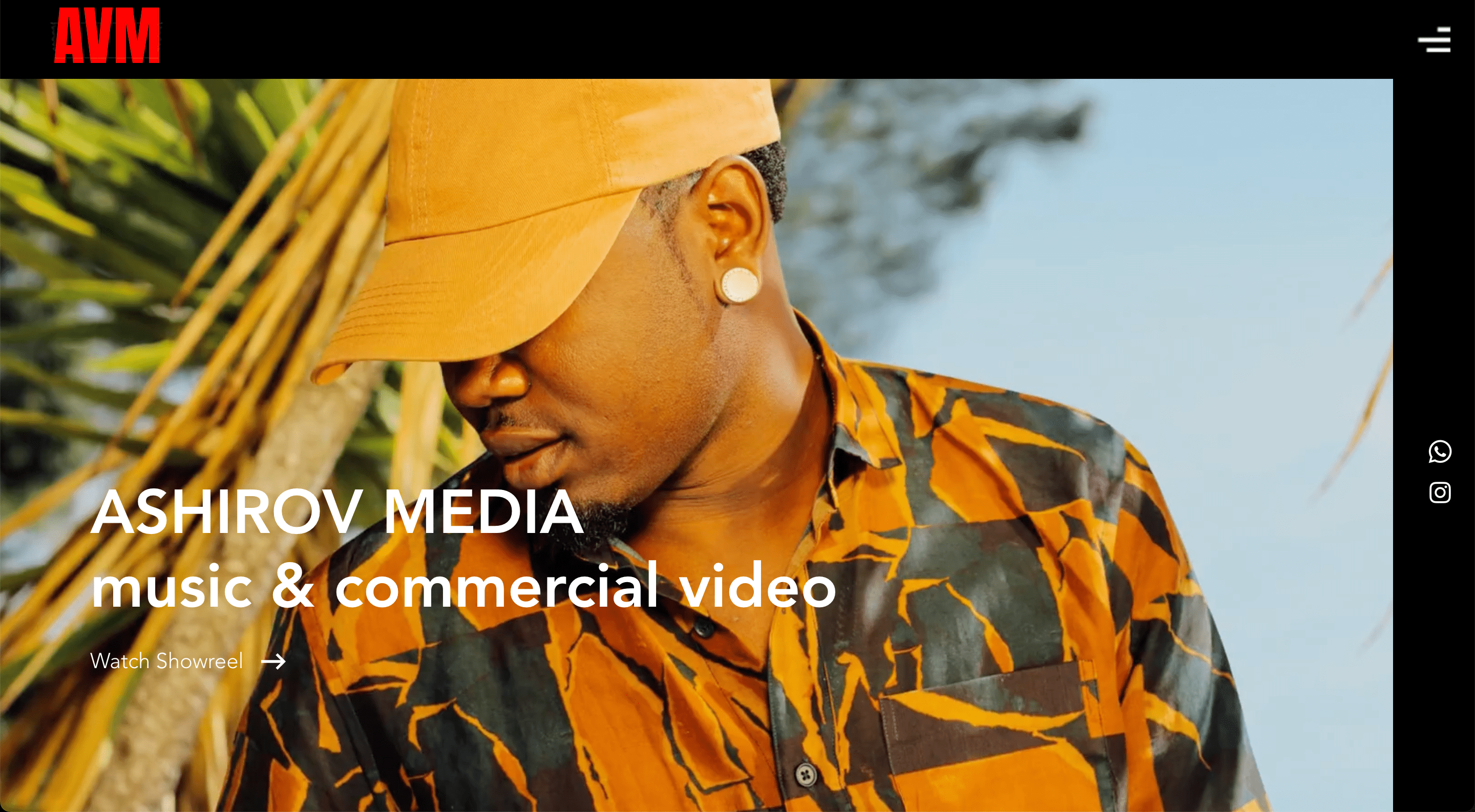
Once you enter the Ashirov Media website, you notice spectacular pictures floating in the background. Showcasing high-quality and stunning photographs on the front page is one of the best ways to stand out and catch the visitor’s attention.
Ashirov media features a non-distracting black header, which allows users to concentrate all their attention on the pictures. Scrolling down, users can view the artist’s featured work, which is beautifully displayed in a grid layout.
Overall, the website is not overloaded with too many elements and shows a cool and modern design.
Notes to take from this website:
- Showcase your work to attract attention;
- Don’t overload the front page with too many distracting elements;
- You don’t have to disclose the page navigation in the header.
Builder used: Wix

Gione de Silva
URL: https://www.gionedasilva.com/
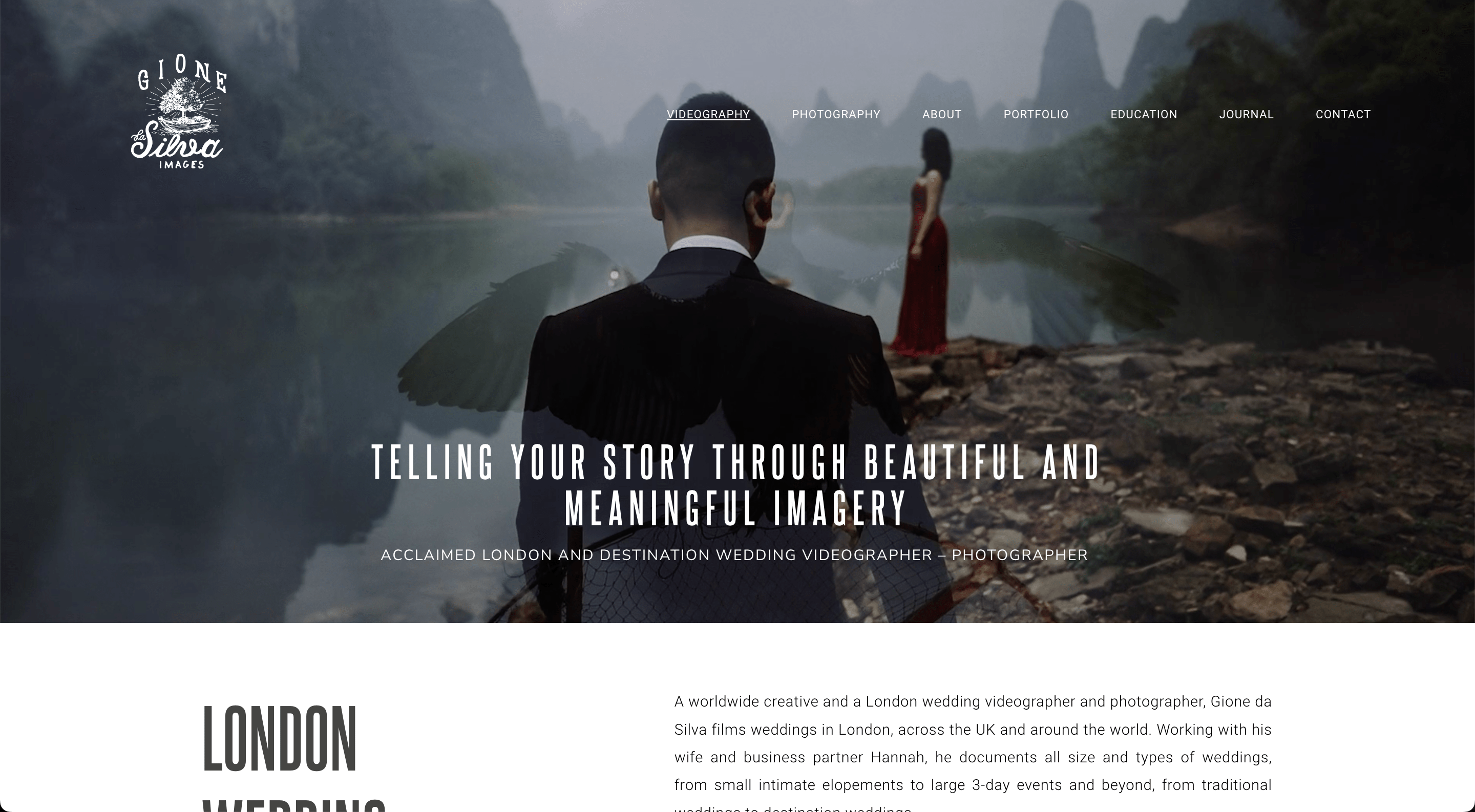
The Gione de Silva’s website features a montage of project videos as a background on the front page. It instantly introduces users to the videographer's style and work quality, which is a great way to get users excited. On top of the video is a short introduction to the videographer-photographer, which might ignite trust for potential customers. A longer introduction to the artist and their services is provided below. We really love how the most important keywords about this business are included on the left of the detailed description. This allows for conveying essential information faster for those users who usually rush through the website.
Notes to take from this website:
- Include bold and huge keywords about your business on your front page;
- Showcase your finished projects in a montage;
- Incorporate a strong introduction that inspires trust in your abilities.
Builder used: WordPress

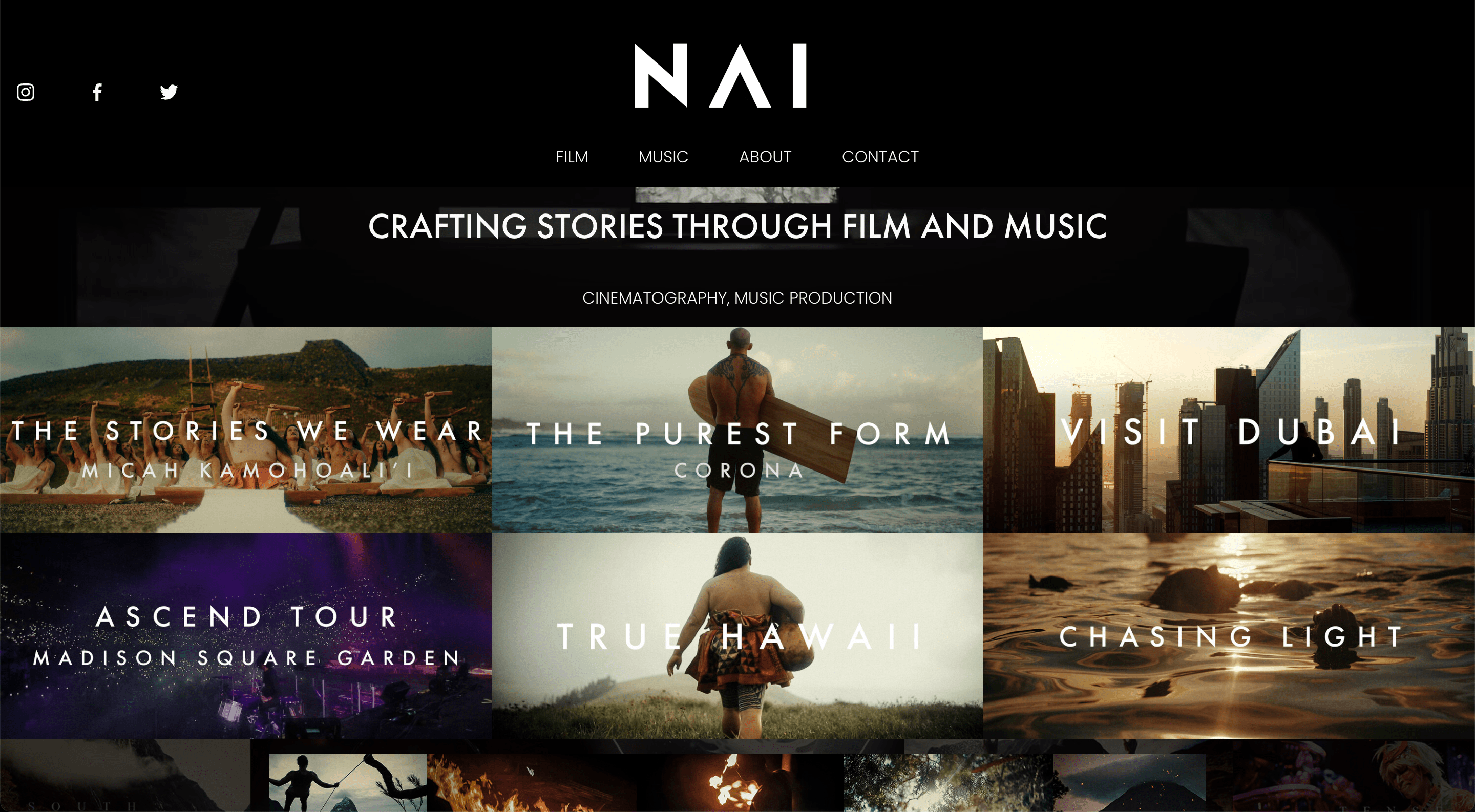
Nainoa Langer
URL: https://www.nainoalanger.com/
Nainoa Langer’s website attempts to attract customers by showcasing various projects on the front page. Each project perfectly portrays the artist’s style and values, instantly setting the mood for visitors. We really like this website’s header as it is black and clearly visible. Its alignment in the center and organized navigation also add to the neat look. At the bottom of the front page, there is also an introduction to the artist’s partners and clients. Adding this kind of block shows potential customers that you are known in the business and can be trusted with serious inquiries.
Notes to take from this website:
- Showcase your projects;
- Keep a well-contrasting design;
- Include your partners to induce trust.
Builder used: Squarespace

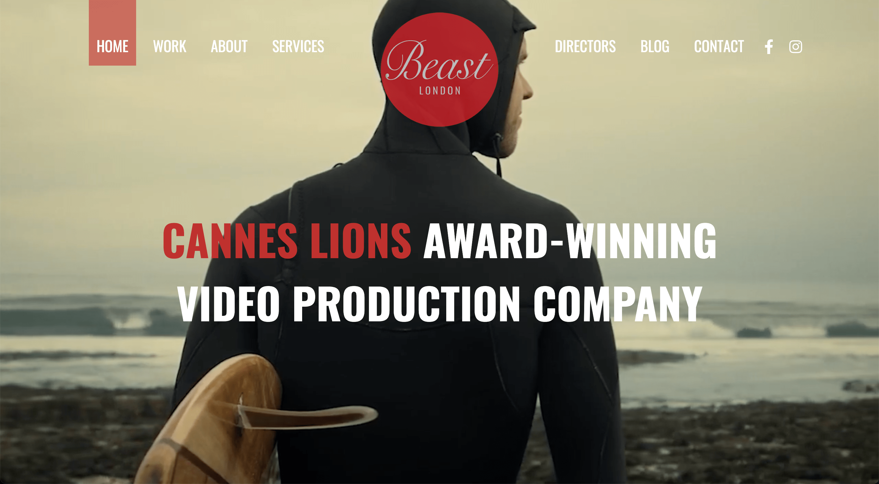
Beast Agency
URL: https://beast.agency/
The Beast Agency uses a great tactic on its website’s front page, introducing itself as a Cannes Lions award-winning video production company. Scrolling down, the users can see and wow at the awards that the company has won. Nothing convinces potential customers more than these kinds of accomplishments, so don’t be shy to boast. We can also notice, that this website offers many options in the header for users to navigate through the website. The website also includes various areas where the visitors are addressed directly. This is an excellent way to create a feeling of familiarity and trust.
Notes to take from this website:
- Boast your accomplishments;
- Address customers directly and provoke them to take action.
Builder used: WordPress

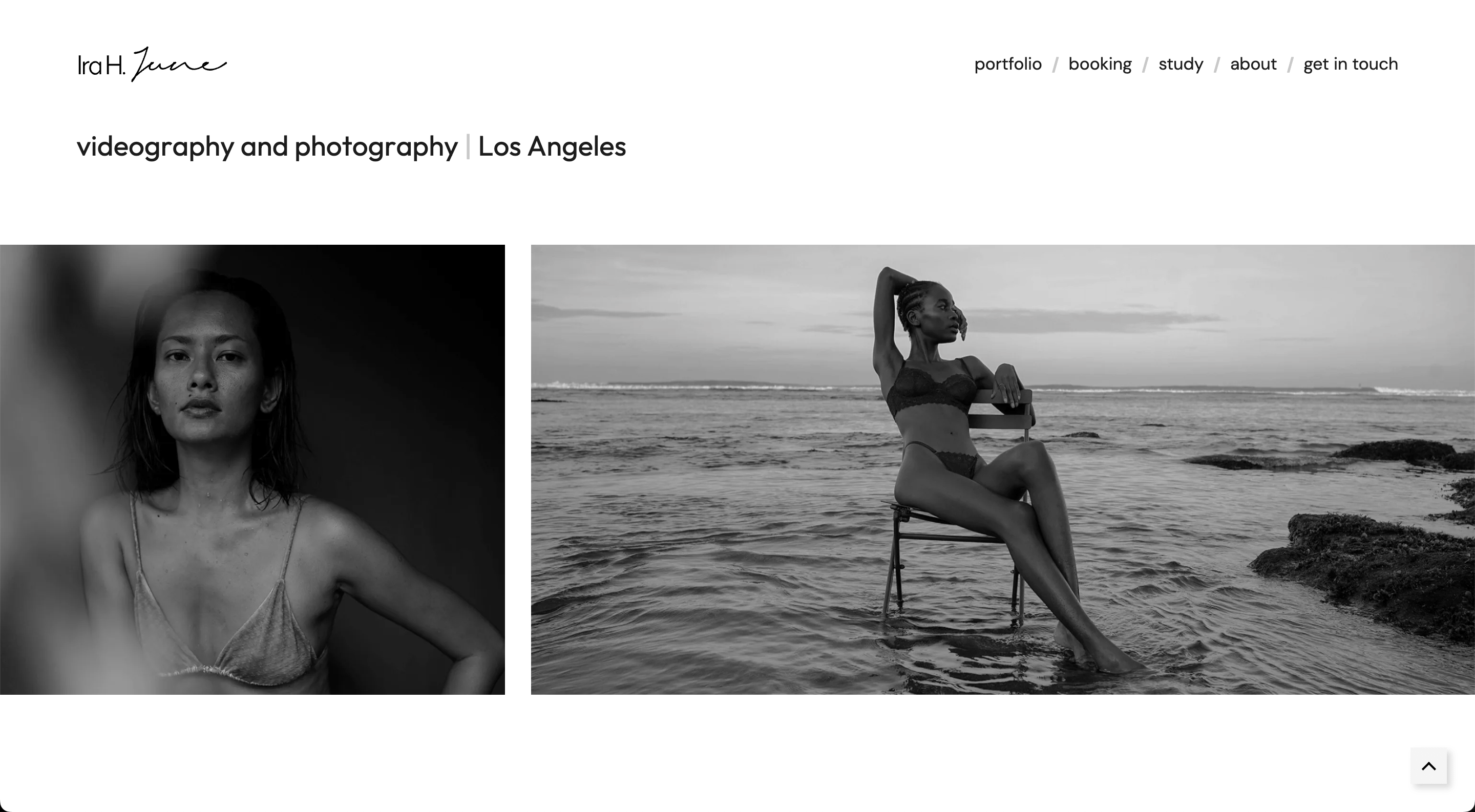
Ira H. June
URL: https://www.irajune.com/
One of the first things that stand out about Ira H. June's website is its stunning and polished visuals. From the homepage to galleries and video samples, every element on the website is carefully designed with aesthetics in mind. Navigating the website is effortless thanks to its user-friendly interface. The front page is well-organized, and visitors can quickly find all the important information. We also love how the front page includes detailed descriptions for each available service and its respective prices. Transparency sometimes is the key to winning new customers.
Notes to take from this website:
- Style the website’s design to fit and emphasize your portfolio;
- Be transparent about your services and pricing;
- Choosing the right layout and design will give a simple, yet stunning look.
Builder used: Webflow

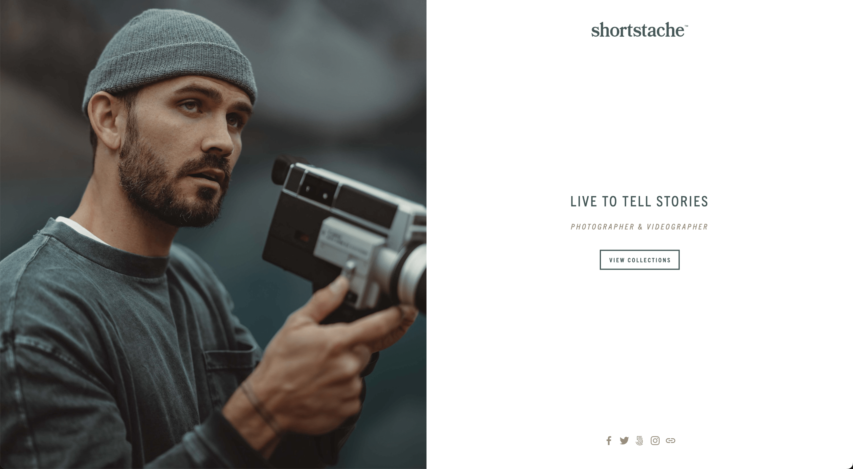
Shortstache
URL: https://www.shortstache.com/
Once you enter the website, you’ll notice it looks like a business card. This is a great way to introduce yourself and your business in a more traditional way. The first page also includes all the necessary social media icons, which is crucial for people working with visual products. Choosing to view collections sends users to a modernly built page with an organized portfolio. The front page is perfectly designed for showcasing finished projects. Although we would like to mention that the header here could be made to be slightly more visible. Choosing a more contrasting color might be a good choice.
Notes to take from this website:
- You can effectively introduce yourself to potential customers using a business card layout;
- Consider avoiding any elements and dedicating your front page to only showcasing your portfolio;
- Choose well-contrasting colors to ensure none of the information is missed.
Builder used: Squarespace

Dear Darling Films
URL: https://deardarlingfilms.ca/
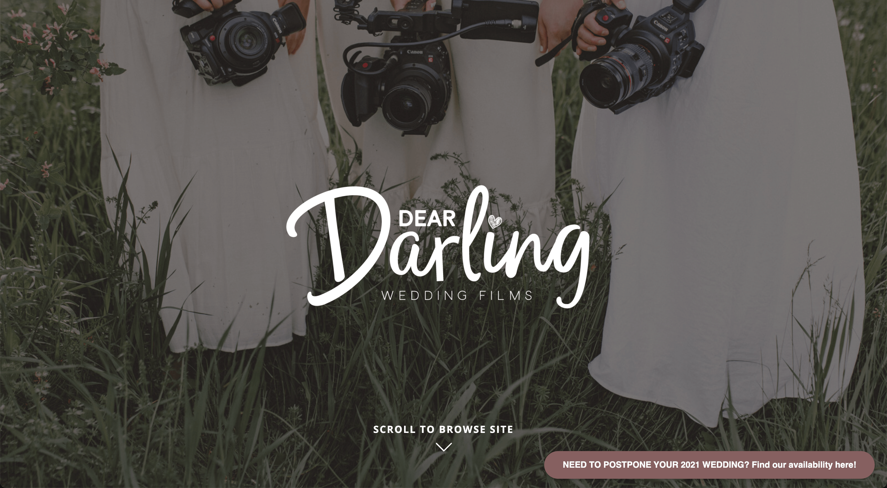
The Dear Darling Films website looks lovely right away as it opens with a candid background picture and cute fonts. Scrolling down, the users are immediately introduced to the team and their work style. The front page also includes a “Featured on” section, which builds to the business’s brand image right away. What we love about this website is the section where the users are directly addressed and asked for their opinion. The team then describes what kind of experiences people should expect from them. This might speak deeply into some potential customers and convince them to work together.
Notes to take from this website:
- Be sure your website’s design portrays your project style well;
- Convince potential customers by giving them an idea of the experience you provide;
- Showcase your accomplishments.
Builder used: Showit

Snack Media Group
URL: https://www.snackmediagroup.com/
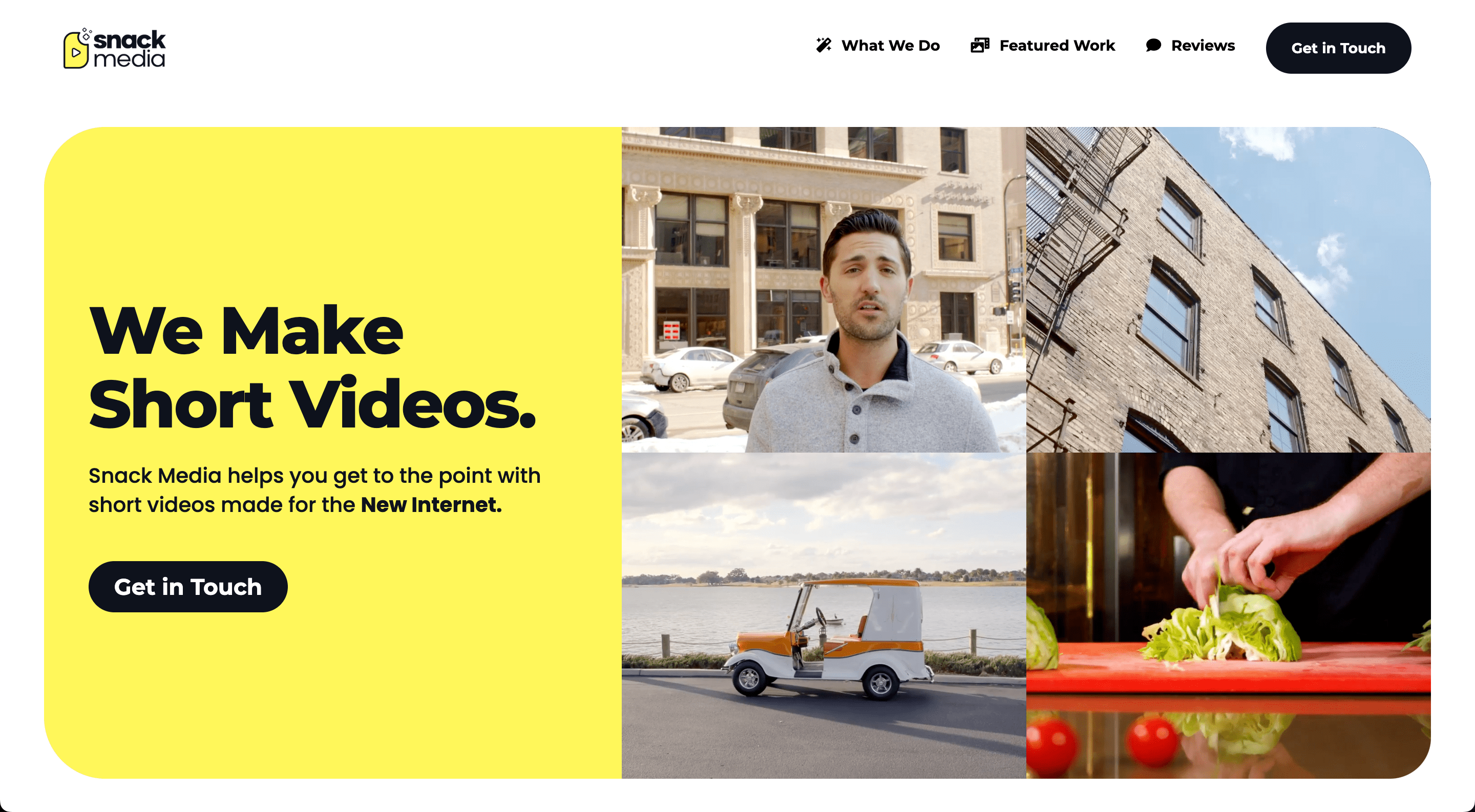
The Snack Media Group website’s design looks eccentric and fun, which is a great way to portray your business if you produce commercials or other short videos. Upon entering the website, users can see a small display of some of the company’s projects and a bold introduction. This looks like a powerful front page, instantly convincing people to become customers. We also love the simplistic header here. Scrolling down, the users can see an incorporated portfolio block, where some of the projects are shown by choosing a preferred area, such as a video.
Notes to take from this website:
- Think of more eccentric ways to showcase your portfolio on the front page;
- Keep your website’s header simple and concise;
- Include bold statements and bring colors to catch the user’s attention.
Builder used: Webflow

Red Creative Films
URL: https://www.redcreativefilms.com/
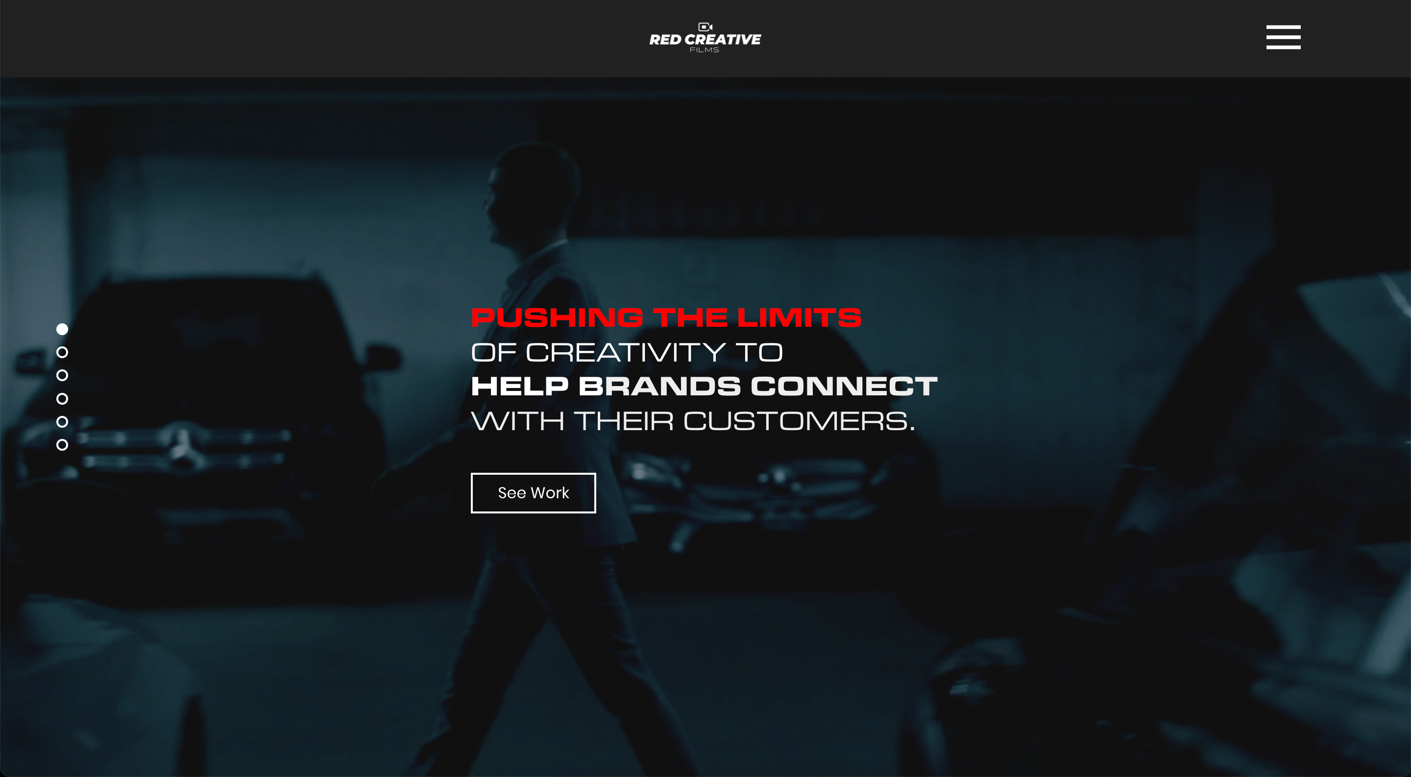
The Red Creative Films website looks simple at first glance, but it lures you in. The front page is combined of various darkened background videos and photographs, which beautifully portray the company’s quality and style. The users are instantly introduced to the brand with a bold statement that is sure to generate interest. The website is extremely user-friendly as they can find all the important information about the company just by seamlessly scrolling down the front page.
Notes to take from this website:
- Use background images and videos to showcase your work;
- Boast about your abilities and status;
- Build a layout that allows customers to easily find all the crucial information about you.
Builder used: Wix

Muon video
URL: https://muonvideo.com/
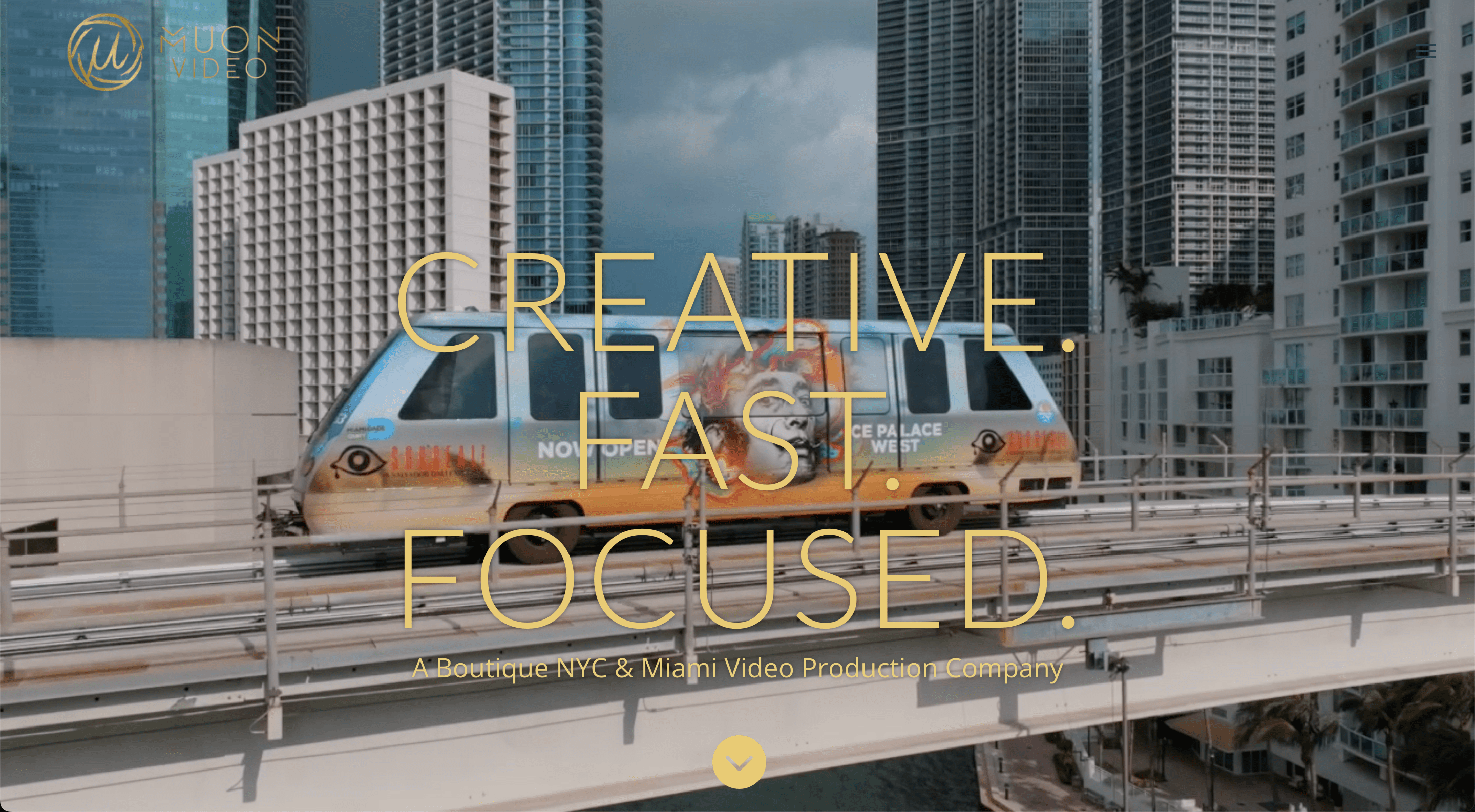
The Muon video website also features a background video on the front page in order to catch the visitor’s attention. We love how the company includes strong keywords in the middle of the page, which quickly describe its values. We can also notice some unique choices here. The front page includes a block, which describes the cinematic process in detail. This builds to the transparency of the company and allows customers to better imagine the potential experience of working with the company. However, we do believe that the portfolio showcase here could be a little bit more charismatic and attractive.
Notes to take from this website:
- Attract potential customers by displaying keywords that best describe your business;
- Incorporating the portfolio on the front page is an essential step, but remember to make it shine.
Builder used: WordPress

Astray Photography
URL: https://www.astrayphotography.com/
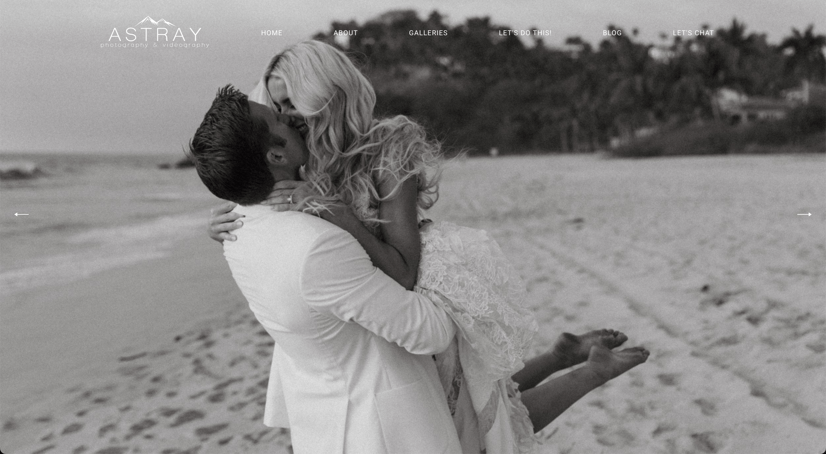
The Astray Photography website features a simple and elegant design, which immediately sets the mood for visitors. Beautiful photographs from the weddings, incorporated on the front page, also build to the whole style and informs potential customers about the business’s area of expertise. The front page includes a detailed introduction and a testimonials block, which help to get to know this business better. We love how the text font, colors, and photograph frames are chosen specifically to enhance the website’s elegant design.
Notes to take from this website:
- Make sure your website’s design is unified to its last detail;
- Set the mood, by choosing the right photographs for your background;
- Include a testimonials block to inspire trust.
Builder used: Squarespace

The Chris Hau
URL: https://thechrishau.com/
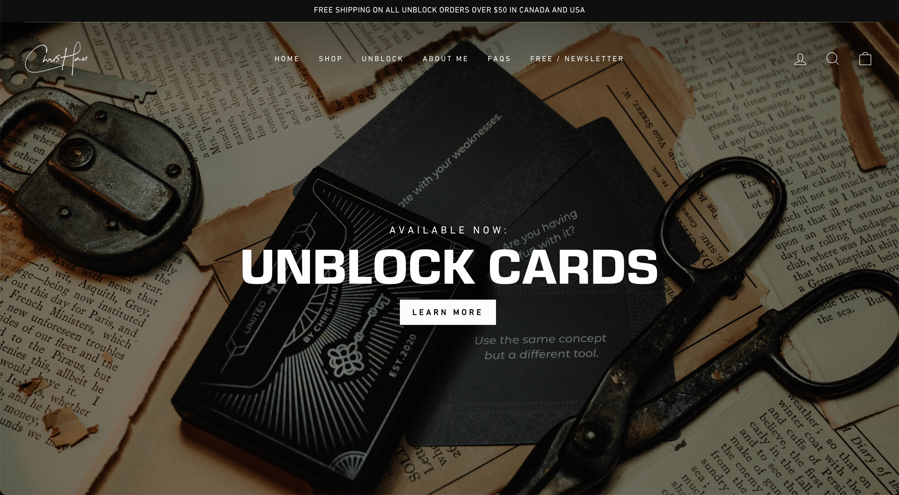
The Chris Hau website is a good example of how a simple layout can make an impression. The website features a floating header, which allows users to easily navigate through the website whenever they want. There are no distracting elements on the front page. Strictly divided blocks also add to the organized look and help in finding all the information quickly. We also like how each section has a clearly visible link, inviting the user to learn more.
Notes to take from this website:
- It is a good idea to clearly divide sections of information, using different images;
- A floating header may give your website a more modern style.
Builder used: Custom

Paradise
URL: https://www.paradise.love/
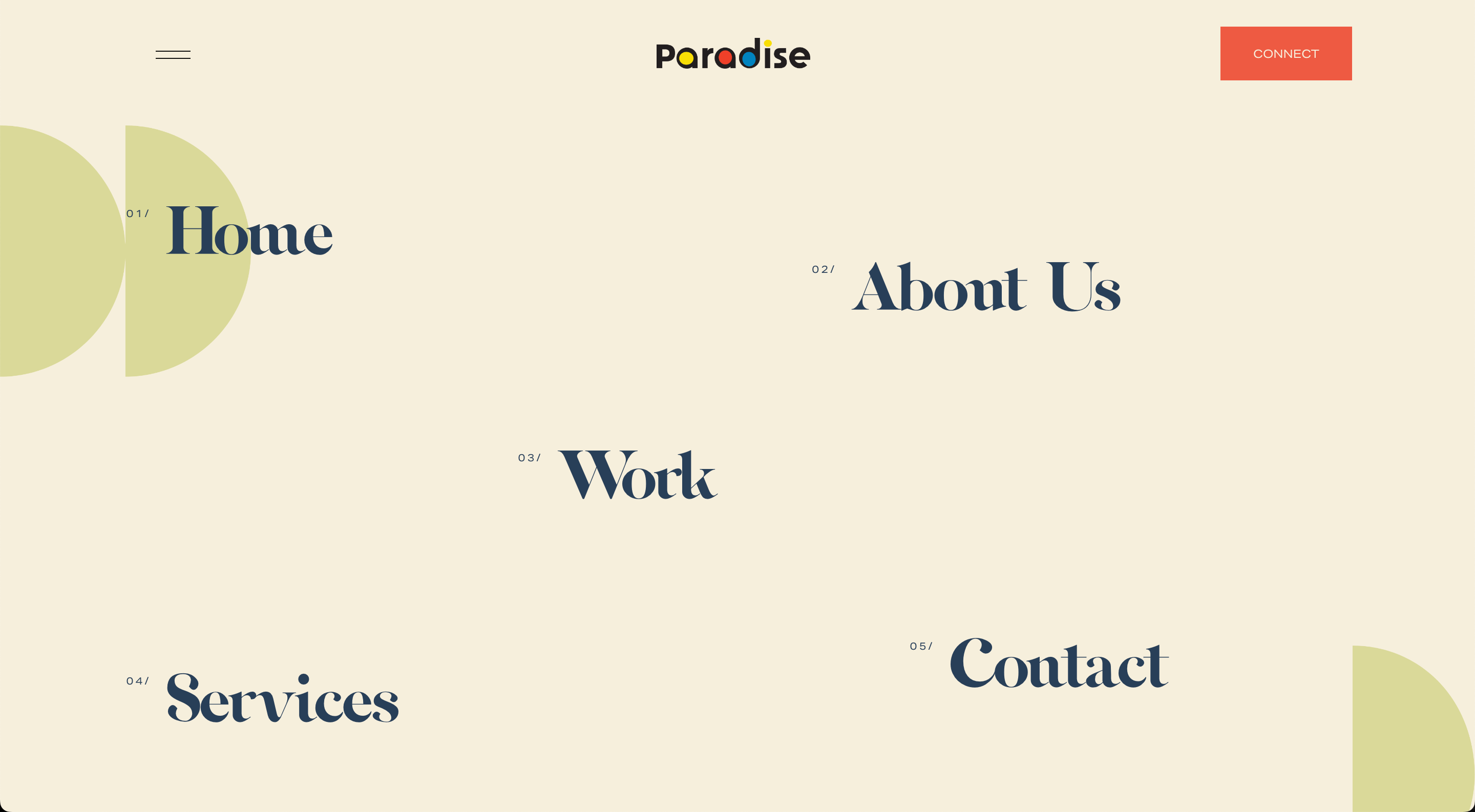
You will notice right away, that the Paradise website features an original and unique design, which instantly grabs your attention. It deviates from the traditional method of including background images and videos. Upon entering the website, users are met with menu options, spread out across the screen. Users are instantly given a choice to navigate wherever they want. It doesn’t distract users with unnecessary elements and allows more focus. Scrolling down the front page, users can of course learn more about the business. However, we can’t decide what’s more convincing here - the company’s impressive experience or the fun and charismatic design.
Notes to take from this website:
- Don’t be afraid to be original with your website’s design;
- Keep your front page neat and not overloaded with unnecessary elements;
- The color choice sometimes makes all the difference in how potential customers view you.
Builder used: Squarespace

Courtney Holmes
URL: https://www.courtneyholmes.com.au/
The Courtney Holmes website’s design is cozy enough to instantly build the right mood for the visitors. The front page instantly introduces users to the available services. It also allows quick navigation to different areas, that visitors might be interested in. It saves the users time by not making them scroll through the whole website. We also love how transparent the artist is by showcasing her work and including a message that speaks truth to every parent. The website is built really well to portray the artist’s style and services and to convince potential customers to give it a shot.
Notes to take from this website:
- Show that you understand your target audience really well;
- Include quick navigation at the top of the page in order not to lose people in a hurry;
- Be open about why your services are special and how they could bring joy to customers.
Builder used: Squarespace
In conclusion, if you are a videographer looking to stand out in an increasingly competitive industry, having an impressive website is key.
We believe that everything we reviewed will help you in building the best website for your videography business.
Showcase your work, convey your creative style and design, and make sure your website isn’t too complex - simplicity is often the best way to be memorable.
With these tips in mind, you can create a website that definitely stands out and attracts potential clients.
